The Housing Risk Map highlights and ranks indicators of demographics and housing risk in each of New York City’s 59 community districts, pulling from data that is available on our Displacement Alert Project (DAP) Portal, alongside census data and other sources. Our annual analysis demonstrates the varied, intersecting risks to New York City’s affordable housing, particularly in communities of color, and helps community-based groups, government officials, and other stakeholders determine where to direct resources and policy solutions to stabilize communities.
View the 2026 Housing Risk Map
About CHPS
The Housing Risk Chart is funded by the Community Housing Preservation Strategies (CHPS) initiative. For over 15 years, through CHPS, the New York City Council has supported two programs to ensure organizations across community districts can work in their neighborhoods to combat the loss of affordable housing in their community:
- The Housing Preservation Initiative (HPI) directly addresses threats to each neighborhood’s affordable housing stock by working with community residents to create neighborhood-based solutions.
- The Community Consultant Contract (CCC) supports front-line anti-displacement services and specialists who work with community residents and constituent services to fight evictions and foreclosures.
The Housing Risk Map makes clear the importance of targeted and individualized programs like HPI and CCC, which allow over 40 community-based organizations to work at a neighborhood level to address specific threats to affordable housing and housing stability.
Key Findings
Geographic inequity in housing risk
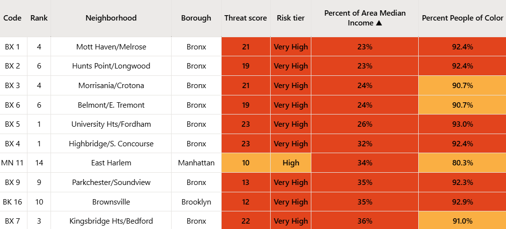
ANHD’s Housing Risk Map reveals the stark geographic disparities in housing risk across New York City – with large concentrations of neighborhoods with high affordable housing risk in the Bronx and Upper Manhattan, and to a lesser extent, eastern and southern Brooklyn and northeast Queens. The Bronx in particular remains the epicenter of housing risk in New York City, with 8 out of the 11 highest risk districts in the city.
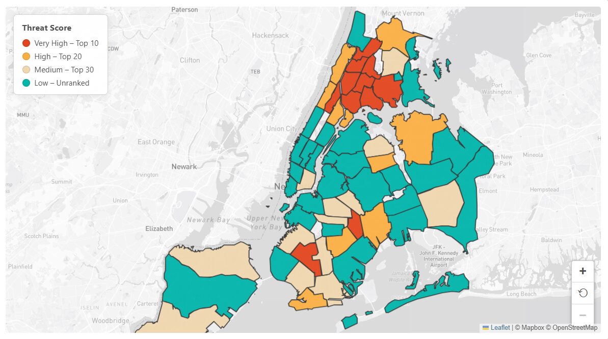
The Bronx is at such a high risk level in part because it has so many community districts with both a high percentage of residents of color and low income levels. 9 out of the 12 Community Districts in the Bronx rank in the top 20 for residents of color (all over 90%) and 10 out of the 12 rank in the top 20 for lowest income levels (all under 50% AMI). These two risk indicators – Percent People of Color and Percent of Area Median Income – have a stronger correlation with a higher housing risk score than any other indicator, serving as an important reminder that addressing housing stability is a core plank of addressing racial inequity in New York City.
Unequal Affordable Housing Production
The geographic inequity in housing risk is also reflected in affordable housing production rates across communities. ANHD’s Housing Risk Map looks at how many affordable units at or below 80% AMI have been completed in each Community District in the last 5 years, highlighting the stark disparities in affordable housing production across our city.[1] The 20 districts with the lowest production rates built just 337 total units serving households at 80% AMI or below. This represents just 1.11% of the over 30,000 units that were completed citywide at those AMI levels. By comparison, the 20 districts with the highest production rates produced over 84% of all affordable units at 80% AMI or below. The districts that have produced the least affordable housing are primarily low risk districts. While it is important that the city continues to build affordable housing in districts with high risk, it must also ensure that more affordable housing options are available in low risk districts, increasing choice, mobility, and stability for New Yorkers most in need.
The Need for Affordable Housing Preservation Alongside New Affordable Production
While there is an urgent need for new affordable housing across the city, it is just as vital that the City focus on preservation: making sure our existing regulated affordable developments remain affordable and in good condition. ANHD’s Housing Risk Map highlights one example of the impact that the loss of existing affordable housing can have on our overall supply by considering the potential loss of expiring LIHTC units. When a LIHTC regulatory agreement period ends, the agreement can be renewed or it can expire, meaning apartments exit affordability requirements and rents can spike. Across the city, there are over 21,000 expiring LIHTC units in the next 5 years that are at risk of losing their affordability. By comparison, a little over 30,000 affordable units at 80% AMI or below have been completed citywide over the previous 5 years. If all those LIHTC units were lost, that would represent a net gain of just under 9,000 affordable units. Many of the Community Districts with the highest potential loss of LIHTC units are low risk districts in Manhattan that are not producing as much new affordable housing today, where the loss of LIHTC units would represent a net loss in affordable housing overall.
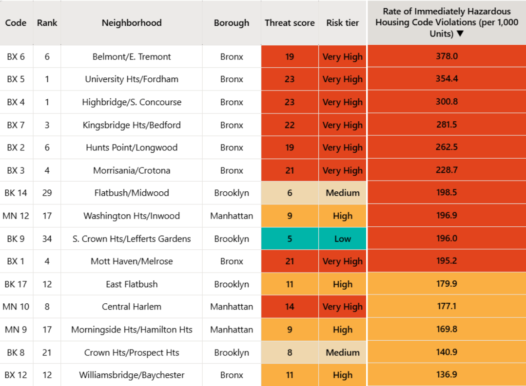
The High Rate of Immediately Hazardous Housing Code Violations
ANHD’s Housing Risk Map includes numerous risk indicators around housing conditions and potential tenant harassment, including the rate of open Class C Housing Code Violations per renter households. Class C Violations are often an indicator of poor housing conditions, and high numbers can indicate systemic lack of repairs and poor building maintenance that rises to the level of tenant harassment. In the 20 districts with the highest rate of open Class C violations, over 10% of all renter units are experiencing violations, and in certain districts that number is over 30%. A majority of these districts are in the Bronx, with 11 of its 12 Community Districts ranking in the top 20.
Percent of Area Median Income is Going Down in Every Community District
The first risk indicator on our table estimates how a community district’s median household income translates to AMI levels – giving a sense of the level of affordable housing that’s needed to best serve the community. Compared to last year’s Housing Risk Chart, community median income levels as a percent of AMI have gone down or stayed static in every single Community District in the city, including those with higher income levels. This is due almost entirely to HUD AMI levels rising for the NYC Metro Area faster than median household income has increased, and reflects the growing divide between HUD AMI levels and the actual median income of communities. Only 11 Community Districts in the city have a median household income that translates to more than 80% of AMI. This discrepancy highlights the urgent need for deeply affordable housing that truly serves our communities.
While these are some of our key findings from the Housing Risk Map, they are not exhaustive of all that the data can show us. The risks to affordable housing throughout our city are multi-faceted and intersecting and the Housing Risk Map seeks to display some of its causes in one place. The purpose of the map is to serve as a resource to help our member groups and policy makers develop effective strategies for addressing the city’s affordable housing crisis – both in the most at-risk neighborhoods and citywide – as we work to prevent displacement and create a city where everyone has access to a safe, stable, and affordable home.
[1] While rents at the 80% AMI level remain unaffordable for many New Yorkers, data limitations prevent us from breaking this down further without excluding all “Low Income” units (51%–80% AMI), so we include 80% AMI and below as the closest measure of truly affordable housing.