ANHD’s 2016 At-Risk Affordable Housing Chart
May 26, 2016
ANHD is today releasing the 2016 edition of How is Affordable Housing Threatened in Your Neighborhood? Each year, this “risk chart” chart takes a variety of indicators of threats to affordable housing and lays them out at a community-district level in a user-friendly format.
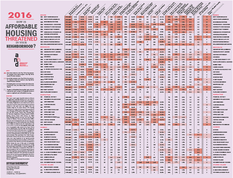 ANHD is today releasing the 2016 edition of How is Affordable Housing Threatened in Your Neighborhood? Each year, this “risk chart” chart takes a variety of indicators of threats to affordable housing and lays them out at a community-district level in a user-friendly format. Each reader of the risk chart will notice issues and patterns that are especially critical in their individual neighborhood, and we hope this information helps community groups and policy makers to develop effective strategies to address the affordable housing crisis.
ANHD staff notes the following striking trends in this year’s data chart:
ANHD is today releasing the 2016 edition of How is Affordable Housing Threatened in Your Neighborhood? Each year, this “risk chart” chart takes a variety of indicators of threats to affordable housing and lays them out at a community-district level in a user-friendly format. Each reader of the risk chart will notice issues and patterns that are especially critical in their individual neighborhood, and we hope this information helps community groups and policy makers to develop effective strategies to address the affordable housing crisis.
ANHD staff notes the following striking trends in this year’s data chart:
How Is Affordable Housing Threatened in Your Neighborhood?

- Real estate speculation is a key driver of the loss of affordability, and the Change in Residential Sales Price column shows which neighborhoods are most affected.
- Many neighborhoods have large numbers of affordable housing built with city subsidy in danger of going market-rate in the next few years, shown by the LIHTC Units Eligible to Expire column.
- Foreclosure is still a significant problem in many communities with smaller 1-4 family homes.
- The column on Families Applying and Eligible for Shelter shows which neighborhoods have the greatest risk of homelessness.