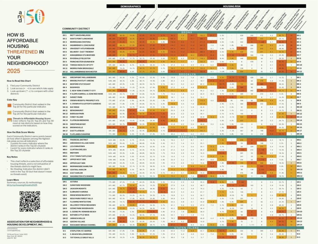
About the Housing Risk Chart
Click here to view the 2025 Housing Risk Chart
On this page, you can find our key findings from the 2025 Housing Risk Chart and full data notes and definitions.
The Housing Risk Chart uses color coding to highlight the highest levels of risk in each district: when a value is orange, it means that Community District ranks in the top ten citywide for that risk. When it’s yellow, it ranks in the top twenty. The last column, the Threats to Affordable Housing Score, tallies up an overall risk score to identify the Top 10, Top 20, and Top 30 most at risk districts, by assigning districts two points for each indicator that ranks in the top ten and one point for each indicator that ranks in the top twenty.
About CHPS
The Housing Risk Chart is funded by the Community Housing Preservation Strategies (CHPS) initiative. For over 15 years, through CHPS, the New York City Council has supported two programs to ensure organizations across community districts can work in their neighborhoods to combat the loss of affordable housing in their community:
- The Housing Preservation Initiative (HPI) directly addresses threats to each neighborhood’s affordable housing stock by working with community residents to create neighborhood-based solutions.
- The Community Consultant Contract (CCC) supports front-line anti-displacement services and specialists who work with community residents and constituent services to fight evictions and foreclosures.
The Risk Chart makes clear the importance of targeted and individualized programs like HPI and CCC, which allow over 40 community-based organizations to work at a neighborhood level to address specific threats to affordable housing and housing stability.
Key Findings
This year’s Risk Chart highlights several themes that reflect both local patterns and broader housing trends. The Bronx remains the epicenter of housing risk in New York City, underscoring long-standing disparities and disinvestment in the borough. As the risk of homelessness rises due to low incomes, high rent burden, overcrowding, and evictions, we continue to see an urgent need for housing vouchers and other tenant supports throughout the city. This is particularly true as development moves forward in too many communities without real affordability – leaving behind those most in need. Finally, risk is rising in lower-density community districts, signaling that affordable housing pressures are expanding beyond traditionally high-risk areas.
This year’s Housing Risk Chart 2025 is released at a time when the housing landscape faces mounting challenges and threats – particularly from the federal government. The Trump administration’s proposed budget would have devastating consequences for millions of New Yorkers who rely on rental assistance vouchers, public housing, city housing code enforcement, and a host of other core public services. Trump’s budget includes a devastating $33.6 billion cut to HUD funding that would slash rental assistance (Section 8) for tenants, putting thousands at risk of eviction. The fallout could trigger widespread mortgage defaults, especially in multi-family buildings in low-income communities. President Trump has also proposed merging and cutting funding from several key housing programs– like Section 8 vouchers, public housing, and housing for seniors and people with disabilities – while capping rental assistance at two years for able-bodied adults. These programs already fall far short of reaching everyone who needs them, and cutting their funding will only further harm the communities that rely on them most.
Bronx as Epicenter of Housing Risk
8 out of the 10 highest risk districts in the city are in the Bronx (BX1 – BX 7 + BX 12) – and all but one district in the Bronx are ranked within the top 30 most-at-risk districts citywide (with BX10, Throgs Neck/Co-Op City, the only exception) – highlighting both the persistence and spread of housing risk across the Bronx. This reflects the fact that Bronx districts rank particularly high for rent burden (averaging over 60%), severe rent burden (30-40%), eviction filings, and housing violations – while having some of the lowest incomes and highest shares of residents of color.
High Risk of Homelessness Shows the Need for Vouchers and Other Tenant Supports
In high risk districts throughout the city, low incomes, high rent burden, overcrowding, and eviction numbers (both filed and marshal evictions) show the increased risk of homelessness for households – and particularly households of color – that cannot afford their homes. These risks, combined with the threats coming at the federal level, show the increased urgency for state and city support for housing vouchers and other support for tenants struggling to stay in their homes or find safe and decent housing they can afford. While the inclusion of a limited Housing Access Voucher Program in the state budget is a win for homeless and at-risk New Yorkers across the state, the $50 million, 4-year program is not nearly enough to cover the increasing need and support for a robust rental assistance program for New York State. All levels of government must do more to address the worsening crisis of homelessness and evictions.
Development Without Affordability: Where New Housing Leaves Communities Behind
Starting last year, ANHD began breaking out the number of new housing units built by year into two categories: Number of New Over 80% AMI & Market Rate Units and Number of New Units at or Below 80% AMI. This distinction helps us better understand which income groups are being served by new development. While rents at the 80% AMI level remain unaffordable for many New Yorkers, data limitations prevent us from breaking this down further without excluding all “Low Income” units (51%–80% AMI). As a result, we include these units within the broader “at or below 80% AMI” category.
In 2024, 33,653 new market-rate units or affordable units over 80% AMI were built across NYC – but affordable units below 80% AMI were left behind:
- Bronx: 6,166 market-rate/over 80% AMI units vs. just 2,299 affordable below 80% AMI. Six districts– including Hunts Points, Morrisania, Riverdale, and Throgs Neck– each saw fewer than 10 affordable units under 80% AMI built, despite the boroughs continued high displacement risk.
- Brooklyn: 13,281 market-rate/over 80% AMI units vs. only 2,153 affordable units below 80% AMI. In 10 out of 18 districts, from Sunset Park to Flatlands, truly affordable development was nearly non-existent.
- Manhattan: 5,362 market-rate/over 80% AMI units vs. just 876 affordable below 80% AMI. Affluent areas like the Financial District, Greenwich Village, and the Upper East Side added no affordable housing under 80% AMI at all.
- Queens: 8,015 market-rate/over 80% AMI units vs. just 1,489 affordable below 80% AMI. In 8 out of 14 districts – including Jackson Heights, Forest Hills, Flushing, Bayside, and Howard Beach – fewer than 5 affordable units under 80% AMI were built. Meanwhile, thousands of market-rate units or affordable units over 80% AMI rose in Astoria, Sunnyside, and Jamaica.
- Staten Island: 829 market-rate units/over 80% AMI units vs. just 19 affordable below 80% AMI. In South Beach and Tottenville, new development offered virtually no affordable units below 80% AMI.
This citywide imbalance reveals a troubling trend: new housing is being built – but not for those who need it most. Affordability is being left out of the growth story in community after community.
Increased Risk in Lower-Density Community Districts
Housing risk is increasing in lower-density, outer-borough Community Districts, particularly in Queens, Staten Island, and the Bronx. Risk scores have increased in places like Jamaica/Hollis (QN12), Rockaway/Broad Channel (QN14), Williamsbridge/Baychester (BX12), and Tottenville/Great Kills (SI3) on the South Shore of Staten Island – showing the need for more affordable housing options in neighborhoods such as these.
Data Notes and definitions
New this year
This year we introduced a new indicator that builds on Percent with Rent Burden by adding Percent with Severe Rent Burden– showing the share of households that are spending over half their income on rent, a critical measure of housing precarity. In the highest ranking districts over 30% of residents are spending over half their income on rent, with 40% doing so in the highest ranking district, Belmont/East Tremont (BX CD 6).
Note on CDTA and PUMA Geographies
Beginning in 2021, the New York City Department of Planning (DCP) adopted a new geography known as Community District Tabulation Areas (CDTAs). These geographies are designed to more closely approximate Community Districts by aligning with Census Tracts– offering greater precision than the federal Public Use Microdata Areas (PUMAS) that ANHD has historically used in the Housing Risk Chart.
However, some indicators– particularly those based on median values within Census Tracts– cannot be calculated using CDTAs. In these cases, data are aggregated using PUMAs, which remain the most viable alternative for community-level estimates.
There are 55 PUMAs in New York City, compared to 59 Community Districts. To compensate for the mismatch in boundaries, the Census Bureau combines four pairs of Community Districts for statistical reporting:
- Bronx:
- Community Districts 1 and 2
- Mott Haven/Melrose and Hunts Point/Longwood
- Community Districts 3 and 6
- Morrisania/Crotona and Belmont/East Tremont
- Community Districts 1 and 2
- Manhattan:
- Community Districts 1 and 2
- Financial District and Greenwich Village/SoHo
- Community Districts 4 and 5
- Clinton/Chelsea and Midtown
- Community Districts 1 and 2
View the map of PUMA and Community District boundaries
Risk Indicators
Percent of Area Median Income, 2023
Definition: To calculate the neighborhood’s Area Median Income (AMI) level, the 2023 median household income is adjusted by its average household size at the PUMA level. The adjusted AMI for a PUMA is then compared to the HUD-determined income limits (a.k.a. 100% AMI) for the entire New York Metro Fair Market Rent Area in 2023. 100% of area median income for a 4-person household in 2023 was $141,200.
Source: Census ACS 5-Year Estimates: Average Household Size, Median Household Income and U.S. Department of Housing and Urban Development (HUD) 2023 Income Limits Documentation.
Why is this indicator included? In high-rent areas like New York, HUD calculates AMI level based on market rents rather than family incomes. New York City uses AMI levels to set income qualifications and rents for affordable housing. We include this indicator to compare actual median incomes of individual community districts to AMI benchmarks.
Percent People of Color, 2023
Definition: Percent of population identifying as Black or African American, American Indian and Alaska Native, Asian, Native Hawaiian and other Pacific Islander, some other race alone, or two or more races for each CDTA. This is the same as the population identifying their race as anything other than White Alone. This definition of people of color does not include those who identify as both Hispanic/Latinx and White Alone.
Source: Census ACS 2023 5-Year Estimates, Race.
Why is this indicator included? Systemic racism in our society’s laws, housing, planning, and policies leads to threats to housing, health, and wellbeing that impact communities of color at dramatically higher rates than white communities. We include this indicator to highlight increased risk and show correlations with other indicators.
Limitations: Grouping non-white racial identities can obscure disparities that often impact Black and indigenous communities most. Census data also obscures important racial and ethnic identities and undercounts communities of color in general. Despite these limitations, for the purpose of this chart we find it useful to include this metric to show close correlation between non-white population and overall risk.
Percent Limited English Proficiency, 2023
Definition: The Census defines a “limited English-speaking household” as one in which all members 14 years and older either do not speak English or do not speak English “very well.” Calculated as the percentage of limited English-speaking households divided by the total number of households of the corresponding CDTA.
Source: Census ACS 2023 5-Year Estimates, Limited English Speaking Households.
Why is this indicator included? Limited English proficiency is a major barrier to accessing crucial information, including government and social services such as a right to counsel in eviction cases, housing lotteries, and more.
Percent with Rent Burden, 2023
Definition: Percent of renter households paying 30% or more of income towards gross rent divided by the total number of renter households of the corresponding CDTA.
Source: Census ACS 2023 5-Year Estimates, Gross Rent as a Percentage of Household Income in the Past 12 Months.
Why is this indicator included? Rent burden is a commonly used indicator of strain on a household’s ability to consistently pay rent and other living expenses. Inability to consistently afford rent can lead to eviction, crowding, shelter entry, and/or homelessness.
Percent with Severe Rent Burden, 2023
Definition: Percent of renter households paying 50% or more of income towards gross rent, divided by the total number of renter households in the corresponding CDTA.
Source: Census ACS 2023 5-Year Estimates, Gross Rent as a Percentage of Household Income in the Past 12 Months.
Why is this indicator included? Severe rent burden signals acute housing unaffordability and financial instability among renters. Households spending half or more of their income on rent may face heightened risks of eviction, displacement, utility shutoffs, food insecurity, and homelessness. This indicator helps highlight communities where renters are most vulnerable to housing insecurity.
Percent with Severe Crowding, 2023
Definition: Percent of households with 1.5 or more occupants per room. Calculated as the total number of households living with 1.5 or more occupants per room divided by the total number of households of the corresponding CDTA, represented as a percentage.
Source: Census ACS 2023 5-Year Estimates, Occupants Per Room.
Why is this indicator included? Overcrowding often indicates a lack of housing affordability and can often precede homelessness, as it is frequently a measure taken after eviction and/or when a household has no other viable housing options.
Rate of Eviction Filings (per 1,000 Renter households), 2024
Definition: Total number of residential non-payment and holdover eviction filings in New York City housing court, divided by the renter household population of the corresponding CDTA.
Source: New York State Office of Court Administration (OCA) via the OCA Data Collective in collaboration with the Right to Counsel Coalition, Census ACS 2023 5-Year Estimates, Tenure.
Why is this indicator included? Eviction filings are one of the most direct indicators of displacement risk that we have, as they show the initiation of a legal process that can end with a tenant’s forceful removal from their home. While not all eviction cases end in evictions, many tenants who are taken to court for eviction “self-evict” because they believe it is their only option, and that is not captured in any data source. Research has shown that tenants with legal representation are much more likely to be able to stay in their homes.
Rate of Residential Marshal Evictions (per 1,000 Renter Households), 2024
Definition: Marshal evictions represent the number of tenants evicted from their homes by a city marshal following a court order. This rate is calculated by dividing the total number of residential marshal evictions by the renter household population of the corresponding CDTA, and then multiplying by 1,000 to get the rate per 1,000 renter households.
Source: Department of Investigations via the Housing Data Coalition’s NYCDB, Census ACS 2023 5-Year Estimates, Tenure.
Why is this indicator included? While eviction filings represent a large universe of potential evictions, marshal evictions represent a subset of evictions that definitively occurred.
Limitations: Marshal evictions are an undercount of all evictions, because tenants can “self-evict” before a court orders a marshal to execute a warrant for eviction.
Rate of Tenant-Initiated Cases (per 1,000 Renter Households), 2024
Definition: Total number of residential HP (housing part), HP with harassment, harassment, and illegal lockout filings in New York City housing court, divided by the renter household population of the corresponding CDTA.
Source: New York State Office of Court Administration (OCA) via the OCA Data Collective in collaboration with the Right to Counsel Coalition, Census ACS 2023 5-Year Estimates, Tenure.
Why is this indicator included? These cases represent legal actions that tenants take against their landlord to make needed repairs, stop harassment, and regain access to their homes after being locked out. Tenant-initiated cases against their landlords represent an important indicator of risk for those tenants and affordable housing in general.
Limitations: This indicator does not capture harassment and lack of repairs that tenants do not bring to housing court, nor do all cases definitively represent tenant harassment that occurred. There is no comprehensive reporting or data source of tenant harassment or systematic lack of housing repairs.
Rate of Immediately Hazardous Housing Code Violations (per 1,000 Units), 2024
Definition: Class C (“immediately hazardous”) violations of the Housing Maintenance Code issued in 2024 by the Department of Housing Preservation and Development (HPD) in all properties. This figure is divided by all residential units in the corresponding community district and then multiplied by 1,000 to find the rate of serious violations per 1,000 residential units. In previous years, only buildings with at least 6 residential units were included in this indicator. In 2024, we made a decision to expand violations to all building sizes, to highlight conditions in smaller buildings as well as larger multifamily buildings.
Source: NYC HPD Housing Maintenance Code Violations and New York City Department of Planning’s PLUTO 24v4 database.
Why is this indicator included? Housing Maintenance Code violations are a commonly used indicator of poor housing conditions, and high numbers can indicate systemic lack of repairs and poor building maintenance that rises to the level of tenant harassment.
Limitations: Violations are only issued when tenants know to report conditions to 311 and those complaints result in an HPD inspector gaining access to the building or unit to inspect conditions. Tenants report frequent issues with HPD inspections after filing complaints with 311. Many tenants also fear retaliation from their landlord if they file complaints with 311, especially if their apartment is not regulated. Therefore, this dataset does not comprehensively capture poor building and apartment conditions.
Rate of Unplanned NYCHA Service Outages (per Building), 2024
Definition: Number of unplanned elevator, heat, hot water, water, and electricity service outages per building in New York City Housing Authority (NYCHA) developments in the corresponding community district. A value of ‘-’ indicates there is no data available; these districts likely have no NYCHA housing.
Source: NYCHA Service Disruptions scraped by the Housing Data Coalition, Development Data Book.
Why is this indicator included? Unplanned service disruptions are one metric of the scale of poor conditions for residents of public housing.
Limitations: NYCHA does not publish performance metrics as open data. The Housing Data Coalition has scraped NYCHA’s dashboard of unplanned service disruptions as one important measure of the scale of poor conditions for residents.
Change in Median Gross Rent. 2018-2023
Definition: The rate of change in median gross rent (monthly rent plus the estimated average monthly cost of utilities) for a community district by PUMA in 2023 versus 2018. 2018 rents are adjusted for inflation to 2023 numbers for comparison.
Source: Census ACS 2023 and 2018 5-Year Estimates, Median Gross Rent and Inflation Calculator using Consumer Price Index data (inflation factor = 1.19806).
Why is this indicator included? Rent increases in a community district indicate changing market conditions that displace many low income residents from their neighborhoods. Tenants in unregulated housing are generally most vulnerable to displacement when neighborhood rents increase.
Change in Residential Sale Price per Square Foot, 2023-2024
Definition: Change in median price per gross square foot of residential buildings of all unit sizes from 2023 to 2024 for each community district by PUMA. To make comparisons as accurate as possible, sales are only included if the building contains no commercial units, the recorded sale price is over $100,000, the gross square footage is over 500 square feet, the price per square foot is over $100, and the number of sales per community district for both 2023 and 2024 is at least 50. Because they do not generally record square footage, condo and coop sales are excluded. In previous years, we compared changes in sale prices over the course of two years. In 2024, we made the decision to compare changes over the course of one year, to show more recent fluctuations.
Source: NYC Department of Finance Annualized Sales.
Why is this indicator included? Increasing residential sale prices are an indicator of displacement pressure and exclusion in a neighborhood. To offset higher sale prices, purchasers will increase rents of individual apartment units. Homeownership also becomes more unattainable for low-income households and people of color. Large increases in sale prices contribute to heightened speculation in the housing market as other sellers aim to match high sale prices.
Limitations: It is difficult to make fair comparisons of residential property values: records and data are imperfect, building typologies vary greatly across and within community districts, there are much higher sale volumes in some districts than others, and there is no straightforward way to compare coop and condo sales with sales of entire residential buildings. Because we are not able to include coops and condos, most Manhattan districts show no data for this indicator; instead, it is more indicative of multifamily rental building and small home sales.
Number of New Over 80% AMI & Market Rate Units, 2024
Definition: Number of total new residential units in 2024, excluding affordable housing units designated as Extremely Low Income (0-30% AMI), Very Low Income (31-50% AMI), or Low Income (51-80% AMI). This indicator includes new market rate and income-restricted housing above 80% AMI.
Source: NYC Department of Planning Housing Database and NYC HPD Affordable Housing Production by Building.
Why is this indicator included? As ANHD’s AMI Cheat Sheet makes clear, 64.5% of New York City’s renter households and 91.5% of New York City’s rent-burdened households make 80% AMI or less. Apartments that are only affordable for households making over 80% AMI, as well as the vast majority of new market-rate units, do not increase the supply of affordable housing for New Yorkers who most need it. In 2024, a two-bedroom apartment above 80% AMI had a rent of more than $2,796.
Limitations: This indicator is calculated using two separate datasets: DCP’s housing database and HPD’s dataset of affordable housing. Because they are compiled differently, there are discrepancies. Three districts showed larger numbers of units below 80% AMI than total new units in 2023: MN 8, BX 2, and BK 13. In those cases, we displayed a value of 0 for this indicator.
Number of New Units at or Below 80% AMI, 2024
Definition: Number of total new affordable housing units designated as Extremely Low Income (0-30% AMI), Very Low Income (31-50% AMI), or Low Income (51-80% AMI).
Source: NYC HPD Affordable Housing Production by Building.
Why is this indicator included? In contrast to the above, this indicator shows how much “lower-rent” housing was added at 80% AMI or lower – meaning the maximum rent for a two-bedroom unit was $2,796.
Limitations: While $2,796 is still too high for most rent-burdened New Yorkers to afford, data did not allow for disaggregation without excluding all “Low Income” affordable units between 51% and 80% AMI, so we chose to include them.
Expiring LIHTC units, 2025-2029
Definition: Number of units in buildings receiving Low Income Housing Tax Credits (4%, 9%, or Year 15 agreements) that are eligible to expire between December 31, 2025 and December 31, 2029, inclusive. Data is current as of December 2024. For more information on LIHTC, see the Furman Center’s Directory of NYC Housing Programs. In previous years, we only included LIHTC 4% and LIHTC 9%. This year, we added LIHTC Year 15 to our calculations. Therefore, overall numbers are significantly higher than in previous years.
Source: NYU Furman Center’s CoreData.nyc.
Why is this indicator included? When a LIHTC regulatory agreement period ends, the agreement can be renewed or it can expire, meaning apartments exit affordability requirements and rents can spike. This has been a particularly concerning issue with the Right of First Refusal – which allows nonprofits to purchase buildings they develop at the end of the regulatory period – being threatened by predatory investors.
Rate of Foreclosure Filings per 1,000 Small (1-4 Unit) Homes, 2024
Definition: Mortgage-related foreclosure filings, also called lis pendens or pre-foreclosures, for buildings with 1-4 residential units. This figure is divided by the total number 1-4 residential unit properties in the corresponding community district and then multiplied by 1,000 to find the rate of foreclosures per 1,000 small homes. This indicator excludes coops and condos.
Source: PropertyShark via DAP Portal.
Why is this indicator included? Systemic racism in lending and economic structures have led to increasingly untenable conditions for Black homeowners and other homeowners of color. Difficulty obtaining high-quality loans lead to precarious circumstances and the risk of falling behind on mortgages, taxes, or utilities. Foreclosure filings indicate that homeowners are at risk of losing their homes and are at risk of speculative and predatory behavior such as deed theft.
Share of Non-Bank Small (1-4 Unit) Home Purchase Loans, 2023
Definition: Percentage of 1-4 unit home purchase loans made by independent mortgage companies, or “non-bank lenders”, that are not covered by the Community Reinvestment Act, as a share of all 1-4 family, owner-occupied, first-lien loans.
Source: Home Mortgage Disclosure Act (HMDA), 2023.
Why is this indicator included? Due to historic and current discrimination and structural racism in the home lending market, many people of color seeking to purchase a home are unable to access traditional bank loans and resort to, or are targeted by, higher cost non-bank lenders, making it harder to build wealth and equity. This pattern is especially pronounced in majority Black communities.