Since the onset of the COVID-19 pandemic, New York City’s compounding historic inequities have ballooned in front of our eyes. Immediately, the pandemic began to ravage communities of color, resulting in a death rate due to COVID-19 that is twice as high for Latinx and Black New Yorkers compared to whites. Communities of color are the majority of our essential workers, who have had heightened exposure to the virus while simultaneously facing economic precarity and overcrowding, exacerbating the spread of the disease. Undocumented immigrant New Yorkers continue to face economic calamity due to mass layoffs and next to zero financial relief. The deaths and economic fallout from COVID-19 have brought our city’s racial inequality into stark view, which comes as no surprise as masses take to the streets to protest police brutality and the ruthless killing of Black people.
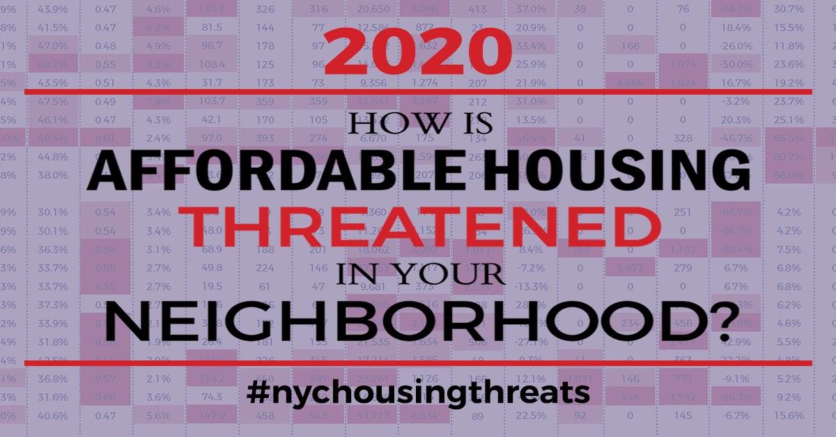
In light of the devastating impact of COVID-19 on New York City, the 2020 edition of ANHD’s Housing Risk Chart How is Affordable Housing Threatened in Your Neighborhood? incorporates COVID-19 impacts and risks into its analysis and confirms a clear pattern: communities of color are the ones facing monumental housing insecurity, economic precarity, and public health disasters.
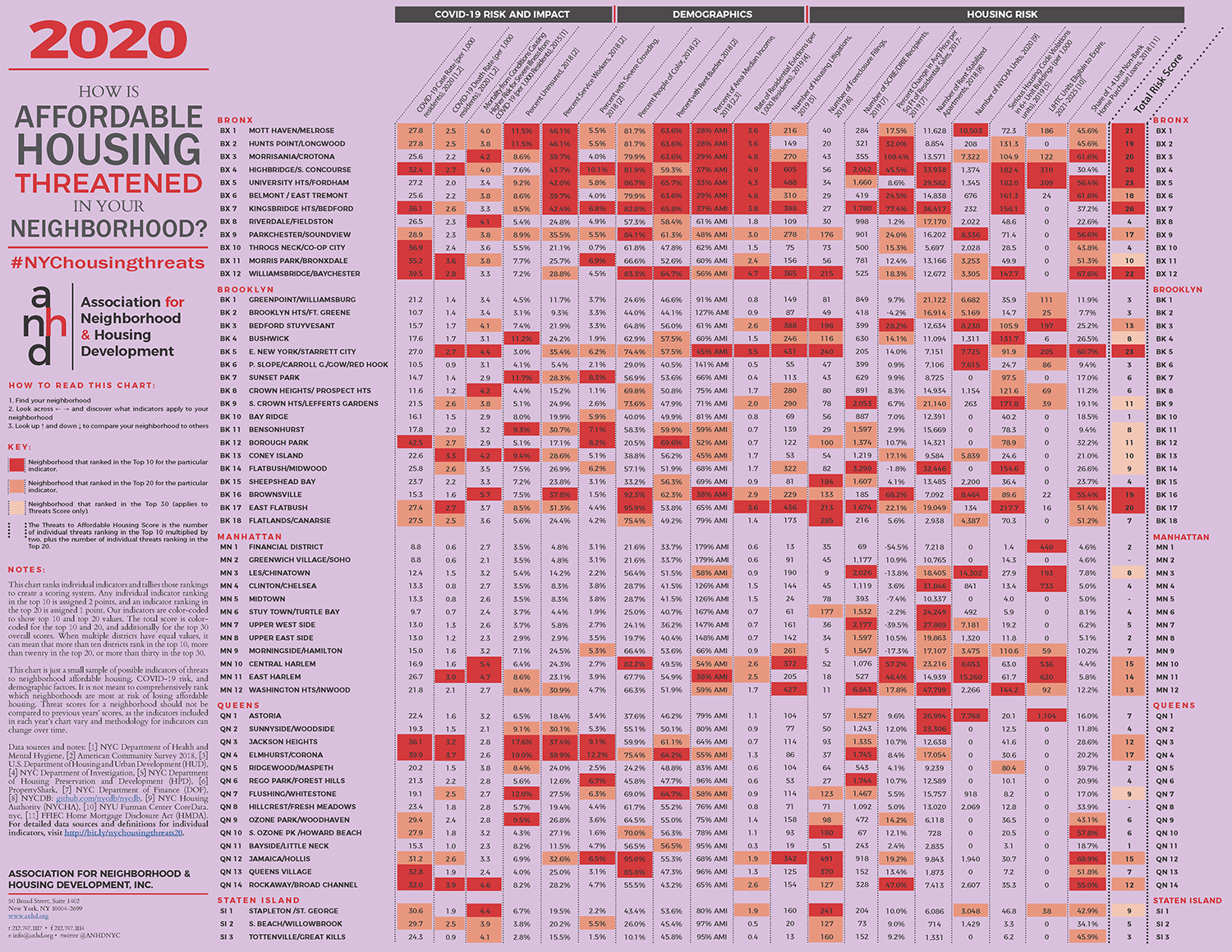
ANHD included never-released, original data on COVID-19 case and death rates by community district from the NYC Department of Health and Mental Hygiene. This new data combined with data on mortality from underlying conditions causing higher risk for severe illness from COVID-19 and the rate of uninsurance with traditional housing risk characteristics like rate of evictions, percent of rent burden, serious housing code violations, and more show us just how connected these issues are.
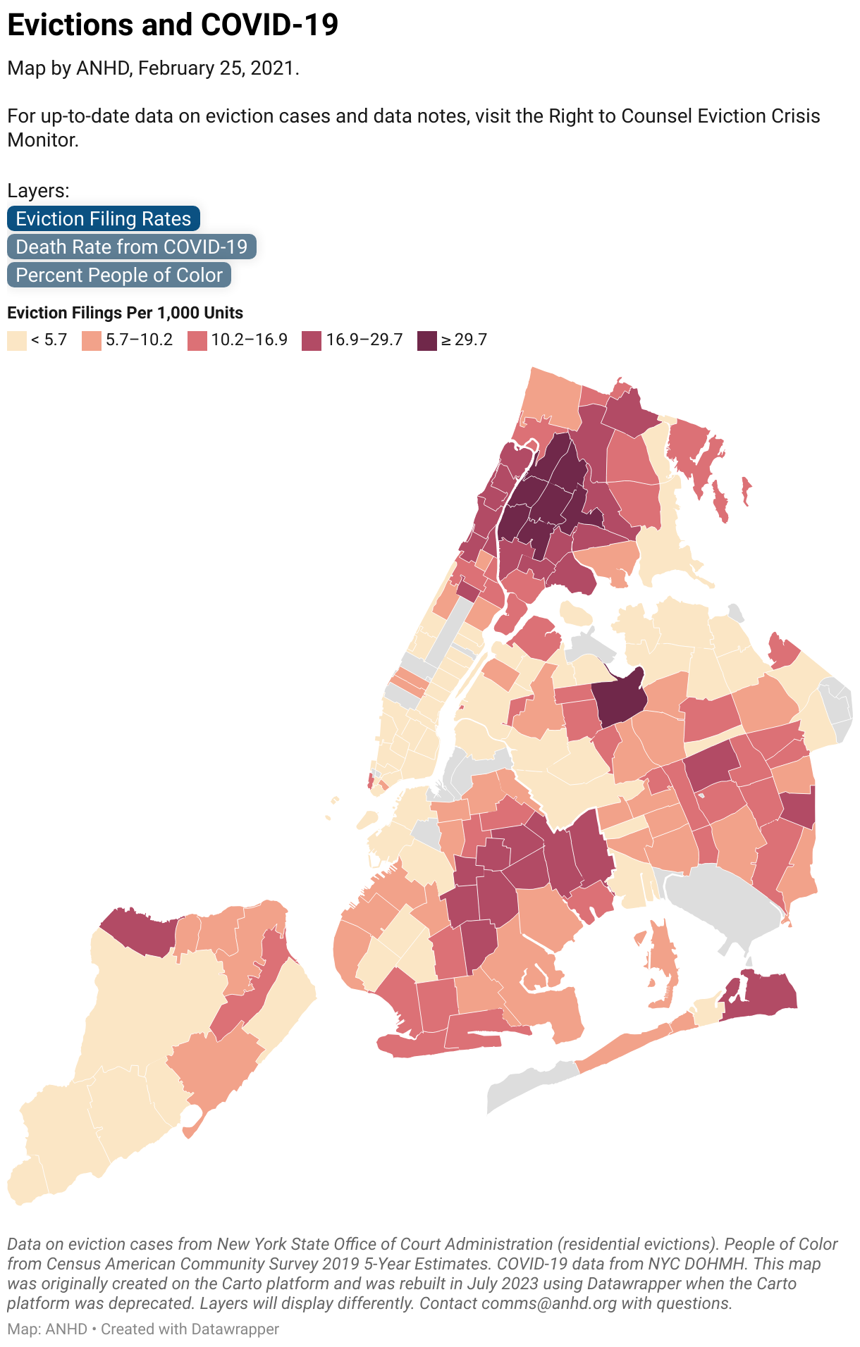
New This Year: In addition to the PDF, we created an interactive map version of our 2020 Housing Risk Chart, showing the close correlation between housing risk and COVID-19 impact. You can also view and download the Risk Chart data in table format below. When citing this information, please be sure to credit ANHD with the following language, “Original research and analysis by the Association for Neighborhood & Housing Development (ANHD).”
Key Findings
The Bronx
- The Bronx ranks highest of all boroughs for COVID-19 impact and related risk factors. Half of the Bronx’s districts ranked highest across the city for COVID cases and deaths, mortality from conditions that cause high risk alongside COVID, and rate of uninsurance.
- South and Northwest Bronx Community Districts (BX 1, 2, 3, 4, 5, 6, 7, 12) are consistently highest in the Bronx and citywide for a variety of threats to housing security and affordability: they rank highest for evictions, rent burden, serious housing violations, and percent increase in residential sales prices. People of color make up between 79.9% and 86.7% of these South and Northwest Bronx districts, and their median incomes are the lowest in the city – the Bronx districts 1 through 7 range from 28% to 37% of Area Median Income (AMI).
- In Highbridge/South Concourse, 4.9 of every 1,000 tenants faced eviction in 2019 and there were 182.4 serious housing violations per 1,000 units while seeing a 45.5% increase in residential sales price per gross square foot. The adjacent neighborhoods of Morrisania/Crotona saw a soaring 108.4% increase in sale prices. This suggests that Bronx tenants are facing dire housing conditions and struggling to pay rent while simultaneously being displaced by increasing prices and gentrification.
Brooklyn
- Bedford Stuyvesant (BK 3), East New York (BK 5), Brownsville (BK 16), and East Flatbush (BK 17) show the greatest housing risk in Brooklyn and contain a high percentage of people of color, ranging from 64.8% in Bedford Stuyvesant to 95.9% in East Flatbush.
- In East New York, 3.5 people out of every 1,000 were evicted last year, the district saw 240 foreclosure filings, and non-bank lenders provided 60.7% of small home loans. East Flatbush had 3.6 evictions per 1,000 residents, 213 foreclosure filings, and 217.7 serious housing code violations per 1,000 units.
- East New York and East Flatbush also have among the highest rates of COVID-19 deaths – both 2.7 per 1,000 people – along with Coney Island (BK 13), which has 3.3 deaths per 1,000 people. Coney Island has high rates of uninsurance and mortality from conditions causing high risk alongside COVID-19 (4.2 per 1,000 people) as well as a relatively high concentration of service workers (28.6%) and low AMI level (45%).
Manhattan
- Central Harlem (MN 10), East Harlem (MN 11), and Washington Heights/Inwood (MN 12) ranked in the top 20 for overall risk factors.
- Central Harlem faces the greatest housing risk in Manhattan and also has the highest density of residents of color (82.2%), while East Harlem has the sixth-highest rate of COVID-19 deaths (3.0 per 1,000 residents) in all of New York City.
- Central Harlem experienced a 57.2% increase in residential sales prices from 2017-2019, while East Harlem saw a 46.4% increase. The neighborhoods had 2.6 and 2.5 evictions per 1,000 residents, respectively.
- Washington Heights/Inwood, with the most rent stabilized units in all of New York City, had 427 litigations filed against landlords and 144.2 serious housing violations per 1,000 units.
Queens
- Five districts in Southeast and Southwest Queens (QN 9, 10, 12, 13, and 14) face high rates of foreclosures and non-bank lenders making high cost loans to homebuyers. Jamaica/Hollis (QN 12) had 491 total foreclosure filings in 2019 and non-bank lenders made 68.9% of loans on 1-4 unit buildings. Three of the five districts rank in the top 20 for density of people of color – 70.0% of South Ozone Park/Howard Beach (QN 10), 95.0% of Jamaica/Hollis, and 85.8% of Queens Village (QN 13).
- Queens districts strongly mirror the correlations of COVID-19 impact with demographics like concentrations of service workers and people of color, overcrowded conditions, and rent burden. The pattern is most stark in Jackson Heights (QN 3), Elmhurst/Corona (QN4), and Jamaica/Hollis. Elmhurst/Corona – with the second highest COVID death rate in the city (3.7 per 1,000 people) – is made up of 39.9% service workers and 75.4% people of color. Twelve and two tenths percent .2% of Elmhurst/Corona households are severely overcrowded (more than 1.5 occupants per room) and 64.2% are rent burdened. Jamaica/Hollis is 32.6% service workers and 95.0% people of color, and 6.5% of households are severely overcrowded. Jackson Heights’s population is 37.4% service workers, 9.1% of households are severely overcrowded, and 61.1% are rent burdened.
Staten Island
- The northernmost district of Staten Island, Stapleton/St. George (SI 1), shows the highest risk for both COVID-19 cases – 30.6 per 1,000 residents – and housing in the borough. It is the only Staten Island district ranking in the top 20 for eviction rate (1.9 per 1,000 residents) and it faces high rates of foreclosure filings (241) and non-bank small home loans (42.9%). However, the Staten Island district with the highest rate of deaths from COVID-19 – 2.5 per 1,000 people – is South Beach/Willowbrook (SI 2), which has a relatively high rate of mortality from conditions causing high risk alongside COVID-19, but otherwise is an outlier for other types of risk captured in the chart.
New York City had an affordable housing crisis before COVID-19, and the 2020 Housing Risk Chart shows that the pandemic has only exacerbated housing insecurity along consistent race, income, and geographic lines. Universal access to stable housing is more critical than ever to create equity and we need investment across all levels of government – city, state, and federal – in affordable housing and protections for tenants and homeowners.
Data Sources & Definitions
Note on Community District and PUMA Geographies
Most data are aggregated by Community Districts, but indicators from the American Community Survey are aggregated by Public Use Microdata Areas (PUMAs). PUMAs are designed by the U.S. Census Bureau and approximate New York City’s Community Districts. However, their boundaries do not coincide precisely with Community District (CD) boundaries. There are 59 Community Districts in New York City, but only 55 Sub-Borough Areas/ PUMAs; four pairs of Community Districts were combined by the Census Bureau to improve sampling and protect the confidentiality of respondents. These pairs are Mott Haven/Melrose (BX 1) and Hunts Point/Longwood (BX 2), Morrisania/Crotona (BX 3) and Belmont/East Tremont (BX 6), the Financial District (MN 1) and Greenwich Village/Soho (MN 2), and Clinton/Chelsea (MN 4) and Midtown (MN 5). Click here for a map of PUMA and Community District boundaries.
The following data definitions are for ANHD’s 2020 Affordable Housing Risk Chart. Email comms@anhd.org with questions.
COVID-19 Case Rate (per 1,000 residents), 2020
The number of positive COVID-19 tests between February 29 and June 11, 2020 divided by the population of the corresponding PUMA. The resulting figure is multiplied by 1,000 to find cases per 1,000 residents. For Community Districts that are combined to make a PUMA (see notes above), the cases for both CDs are summed and divided by the PUMA population. Source: direct from NYC Department of Health and Mental Hygiene (DOHMH) and U.S. Census American Community Survey (ACS) 2018 1-Year Estimates, Total Population.
COVID-19 Death Rate (per 1,000 residents), 2020
The number of confirmed deaths due to COVID-19 between March 11 and June 11, 2020 divided by the population of the corresponding PUMA. The resulting figure is multiplied by 1,000 to find deaths per 1,000 residents. For Community Districts that are combined to make a PUMA (see notes above), the deaths for both CDs are summed and divided by the PUMA population. Source: direct from NYC DOHMH and ACS 2018 1-Year Estimates, Total Population.
Mortality from Conditions Causing Higher Risk for Severe Illness from COVID-19 (per 1,000 Residents), 2015
This indicator shows the prevalence in a neighborhood of underlying conditions that can cause severe illness and death in patients with COVID-19. These figures aggregate mortality rates due to asthma, cancer, diabetes, heart disease, Human Immunodeficiency Virus (HIV), essential hypertension and renal diseases, and liver disease. Note that the most recent data available is from 2015, five years before the COVID-19 pandemic. Source: DOHMH Bureau of Vital Statistics Mortality data, 2015, accessed via Epiquery: https://a816-health.nyc.gov/hdi/epiquery.
Percent Uninsured, 2018
Percent of population with no health insurance coverage. Source: ACS 2018 1-Year Estimates, Health Insurance.
Percent Service Workers, 2018
Percent of employed civilian population 16 years and over in the following occupations: healthcare support, food preparation and serving related, building and grounds cleaning and maintenance, and transportation and material moving. Source: ACS 2018 1-Year Estimates, Occupation for Employed Civilian Population 16 Years and Over.
Percent with Severe Crowding, 2018
Percent of renter households with 1.5 or more occupants per room. Source: ACS 2018 1-Year Estimates, Occupants Per Room (Renter-Occupied Housing Units).
Percent People of Color, 2018
Percent of population identifying as Black or African American, American Indian and Alaska Native, Asian, Native Hawaiian and other Pacific Islander, some other race alone, or two or more races. This is the same as the population identifying their race as anything other than White alone. This definition of People of Color includes those who identify as Latinx and any race other than White, as the Census Bureau considers Latinx identity an ethnicity and not a race. ACS 2018 1-Year Estimates, Race.
Percent with Rent Burden, 2018
Percent of households paying 30% or more of income towards gross rent. Source: ACS 2018 1-Year Estimates, Gross Rent as a Percentage of Household Income.
Percent of Area Median Income, 2018
To calculate the local Area Median Income (AMI) level, the median household income of a PUMA is adjusted/prorated by its average household size and compared to the HUD-determined income limits for the entire New York Metro Fair Market Rent Area. Source: American Community Survey (ACS) 2018 1-Year Estimates, Average Household Size, Median Household Income and U.S. Department of Housing and Urban Development 2018 Income Limits Documentation.
Rate of Residential Evictions (per 1,000 Residents), 2019
Number of individual evictions recorded by court-ordered marshals, divided by the population of the corresponding PUMA. The resulting figure is multiplied by 1,000 to find evictions per 1,000 residents. For Community Districts that are combined to make a PUMA (see notes above), the evictions for both CDs are summed and divided by the PUMA population. We de-duplicate records with identical addresses, unit numbers, eviction date, and marshal last names. Source: NYC Department of Investigations Evictions data.
Number of Housing Litigations, 2019
Housing Court actions initiated by HPD against owners of privately-owned buildings or initiated by tenants against private owners. Source: NYC HPD Litigations data.
Number of Foreclosure Filings, 2019
Mortgage-related foreclosure filings, also called lis pendens or pre-foreclosures, for all building and property types. Source: PropertyShark.
Number of SCRIE/DRIE Recipients, 2019
Tenants with active Disability Rent Increase Exemption (DRIE) or Senior Citizen Rent Increase Exemption (SCRIE) benefits. DRIE and SCRIE are only available to tenants in rent-stabilized buildings and freezes the rent for qualifying tenants by offsetting increases with reductions in property taxes. Source: direct from NYC Department of Finance (DOF).
Percent Change in Avg Price per Sq Ft of Residential Sales, 2017-2019
Change in average gross price per square foot of residential buildings from 2017 to 2019 for each Community District. Sale prices of less than $100,000, sales with recorded gross square footage of less than 500 sq ft, and buildings containing commercial units are excluded. Community Districts lacking enough sales records to calculate a change show a value of ‘-’. Source: NYC DOF Rolling Sales.
Number of Rent Stabilized Apartments, 2018
Number of rent-stabilized apartments as registered with the New York State Division of Homes and Community Renewal and pulled from NYC DOF property tax bills. These numbers include properties with 421a and J-51 tax abatements as well as other regulatory programs requiring rent stabilization. Source: NYCDB https://github.com/nycdb/nycdb.
Number of NYCHA Units, 2020
Number of units in New York City Housing Authority developments. Source: NYCHA Development Data Book data.
Serious Housing Code Violations in 6+ Unit Buildings (per 1,000 units), 2019
Newly issued Class C violations of the Housing Maintenance Code issued by HPD in properties with 6 or more residential units. This figure is divided by all residential units in 6+ unit properties in the corresponding Community District and then multiplied by 1,000 to find the rate of serious violations per 1,000 residential units.
LIHTC Units Eligible to Expire, 2021-2025
Number of units in buildings receiving Low Income Housing Tax Credits (4% or 9%) that are eligible to expire between December 31, 2020 and December 31, 2024, inclusive. Data is current as of September 2019. Source: NYU Furman Center’s CoreData.nyc.
Share of 1-4 Unit Non-Bank Home Purchase Loans, 2018
Number of 1-4 unit home purchase loans made by independent lenders (non-bank, excluding credit unions), who are not covered by the Community Reinvestment Act, as a share of all 1-4 unit home purchase loans. Source: FFIEC Home Mortgage Disclosure Act (HMDA).