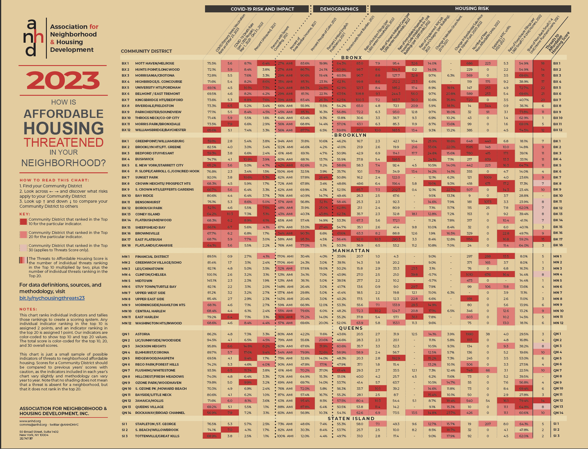
Made possible with discretionary funding from the New York City Council through their Community Housing Preservation Strategies Initiative (CHPSI), the 2023 Housing Risk Chart demonstrates the varied, intersecting risks to affordable housing and stability for communities of color and neighborhoods that are home to historically marginalized groups. The Risk Chart breaks down 18 interconnected indicators related to COVID-19 risk and impact, neighborhood demographics, and threats to affordable housing for each of New York City’s 59 community districts (click here for a map) to inform targeted neighborhood-level action.
For over 15 years, through CHPSI, the New York City Council has supported two programs to ensure organizations across community districts can work in their neighborhoods to combat the loss of affordable housing in their community:
-
The Housing Preservation Initiative (HPI) directly addresses threats to each neighborhood’s affordable housing stock by working with community residents to create neighborhood-based solutions.
-
The Community Consultant Contract (CCC) supports front-line anti-displacement services and specialists who work with community residents and constituent services to fight evictions and foreclosures.
The Risk Chart makes clear the importance of targeted and individualized programs like HPI and CCC, which allow over 40 community-based organizations to work at a neighborhood level to address specific threats to affordable housing and housing stability.
The Risk Chart uses color-coding to highlight the highest levels of risk in each district: when a number is red, it means that Community District ranks in the top 10 citywide for that risk. If it’s pink, it ranks in the top 20. And the last column, the Threats to Affordable Housing Score, tallies up an overall risk score by giving a district two points for an indicator in the top 10 and one point for an indicator in the top 20. View the full chart for yourself here.
On this page, you can find our key findings from the 2023 Housing Risk Chart, an interactive and downloadable data table, and full data notes and definitions.
When citing this information, please credit ANHD with the following language: “Original research and analysis by the Association for Neighborhood & Housing Development (ANHD), https://anhd.org/report/how-affordable-housing-threatened-your-neighborhood-2023.” If you have questions, contact comms@anhd.org.
Key Findings
General
The Housing Risk Chart data points to long-standing practices in Black, Brown, and immigrant communities where threats to existing affordable housing occur alongside speculation in the housing market, the addition of high-rent units to a neighborhood, and an increase in rents across all housing. These simultaneous pressures point to a need for localized efforts to stabilize New Yorkers in their homes alongside the creation of deeply affordable housing for those who need it most.
-
One trend that is clear in this year’s risk chart is the combined factors of low income, high shares of people of color, large additions of non-affordable units (defined as market-rate or income-restricted above 80% AMI), pending expiration of LIHTC units, which are generally targeted to those making 60% AMI or less, and increases in median rents and/or residential sale prices. These combined factors paint a picture of gentrification and displacement of long-term residents of color about which ANHD and our members have been sounding the alarm for many years. This year’s risk chart highlights that in low-income communities of color, new units are priced well out of reach for the vast majority of residents, while residents simultaneously face threats to existing affordable housing.
Click the image or swipe to explore five highlighted community districts
Eviction filings skyrocketed in the last year and were highest in neighborhoods that are predominantly people of color.
The 2023 Housing Risk Chart shows that eviction filings, one of the most direct indicators of displacement risk for renters, primarily occur in neighborhoods that are mostly people of color and have some of the lowest incomes in New York City. Pandemic-era protections against evictions expired on January 15, 2022, opening the floodgates to large volumes of cases moving through housing court, with dire consequences.
-
The top ten eviction filing rates ranged from 83.0-121.3 filings per 1,000 renter households in 2022, up from 37.2-40.8 in 2021, demonstrating the rapid escalation of eviction cases that has overwhelmed housing courts, tenants, and attorneys.
-
Among the top ten CDs with the highest rates of eviction filings, eight are in the Bronx (BX 1-7 and 12), with two in Brooklyn (South Crown Heights/Lefferts Gardens, BK 9, and East Flatbush, BK 17).
-
Nine out of these ten CDs are over 80% people of color and seven out of ten rank in the lowest AMIs citywide, all below 40%.
Risks to homeownership such as non-bank lending and foreclosures are highest in communities of color in the Bronx, Brooklyn, and Queens, reinforcing historic cycles of redlining.
-
Brooklyn has the highest rates of small home foreclosures citywide, with eight community districts ranking in the top 10, and the highest occurring in Brownsville (BK 16) at a rate of 22.8 foreclosures per 1,000 small homes.
-
Each one of the ten districts with the highest rates of non-bank home purchase loans have higher than average shares of people of color (68.8%-95.4%, compared to a citywide share of 66.7%) and half of them have incomes below 50% AMI. Six out of the ten districts are in the Bronx, three are in Queens, and one is in Brooklyn. Non-bank home purchase loans are generally higher cost, reinforcing cycles of the financial sector and government depriving Black, Brown, and immigrant communities of homeownership and wealth-building.
The Bronx
As in previous years, Bronx districts rank highest for threats to affordable housing citywide. Compounding risk factors point to long-standing disinvestment from Bronx communities, particularly those with the highest shares of people of color.
-
Bronx districts 1 through 7, spanning west of the Bronx River up to Woodlawn Cemetery, all rank in the top ten overall threats to affordable housing.
-
BX 1-7 and Williamsbridge/Baychester (BX 12) rank particularly high for eviction filings (83.0-121.3 per 1,000 renter households), rent burden (59.8%-64.3%), tenant-initiated housing court cases (7.2-10.0 cases per 1,000 renter households), immediately hazardous housing violations (95.4-244.3 per 1,000 units in 6+ unit buildings), and unplanned NYCHA service outages (13.4-56.0 per building).
-
Those same districts are among the lowest income (27% AMI – 56% AMI), highest shares of people of color (81.1%-90.6%), highest shares of limited English proficiency (19.4%-26.3%), high shares of uninsured population (7.6%-10.1%), and low recorded rates of COVID vaccinations (70.4%-73.2%).
Brooklyn
Brooklyn neighborhoods are experiencing some of the highest rates of non-affordable housing production, increases in median gross rent, in especially high-income neighborhoods, and high rates of rent burden throughout all neighborhoods, regardless of income level or rent increases. Brooklyn shows a great variety of threats to affordable housing, and the borough also encompasses districts with widely divergent income levels, paralleled only by Manhattan.
-
Brooklyn had the highest rent increases in New York City from 2016-2021, ranging from 19.1% in Crown Heights (BK 8) to 33.6% in Brooklyn Heights/Fort Greene (BK 2).
-
Brooklyn has the most LIHTC units scheduled to expire in the next five years of all boroughs, containing 70% of the total 8,554 expiring units citywide.
-
Brooklyn has the highest rates of foreclosure filings in any borough, with seven of its districts ranking in the top 10 citywide, ranging from 13.3 foreclosures per 1,000 small homes in Bushwick (BK 4) to 22.8 in Brownsville (BK 16), also the highest rate citywide.
Manhattan
New York City’s most affluent borough shows fewer overall housing risks than the Bronx, Brooklyn, and Queens. However, the districts with the highest shares of people of color and lowest incomes, despite intense gentrification in recent years and decades, are generally the ones with the highest risk factors in the borough.
-
Upper Manhattan, including Morningside/Hamilton Heights (MN 9), Central Harlem (MN 10), East Harlem (MN 11) and Washington Heights/Inwood (MN 12), with shares of people of color ranging from 66.9% in Morningside/Hamilton Heights to 79.6% in Central Harlem and AMIs ranging from 36% in East Harlem to 59% in MN Morningside/Hamilton Heights, show relatively high risk levels for the borough. Those districts have high rates of eviction filings, tenant-initiated cases, code violations, unplanned NYCHA service outages, increases in median gross rents, new non-affordable units, and foreclosure filings.
-
One exception to the trend is Clinton/Chelsea (MN 4), which has a high rate of unplanned NYCHA service outages, a high number of expiring LIHTC units, and a high rate of foreclosure filings.
-
Clinton/Chelsea and Midtown (MN 5) saw the only decreases in median rents from 2016-2021, of 5.7%.
Queens
-
Seven out of 14 Queens districts rank in the top 20 citywide in median rent increases from 2016-2021, ranging from 12.5% in Elmhurst/Corona (QN 4) to 15.4% in Bayside/Little Neck, QN 11.
-
Jackson Heights (QN 3), Elmhurst/Corona (QN 4), and Flushing/Whitestone (QN 7), which each ranked in the top 10 citywide for shares of the population with limited English proficiency (31.9% in QN 3 to 37.0% in QN 7), also have high shares of rent burdened households (58.9% in QN 4 to 61.4% in QN 7). QN 3 and QN 4 also have high rates of severe crowding (8.2% in QN 3 and 9.4% in QN 4).
-
Queens follows Brooklyn for most new non-affordable units added in 2022 with 6,099 total units added in the borough. More than half of all the non-affordable units that were added in the borough are in Astoria (QN 1) with 1,990 units and LIC/Sunnyside/Woodside (QN 2) with 1,113 units.
-
Two districts with large shares of small homes follow the trend of share of the population of people of color mirroring risk to homeownership like foreclosures and non-bank loans. Jamaica/Hollis (QN 12), where 95.4% of the population is people of color, had 16.1 foreclosures per 1,000 small homes and 79.4% of loans were non-bank, and Queens Village (QN 13), where 87.8% of the population is people of color, had a foreclosure rate of 11.1 and 64.8% non-bank loans.
Staten Island
-
While risks in Staten Island were low compared to other boroughs, there were still high rates of some risk factors, especially in Stapleton/St. George (SI 1). All three SI districts ranked in the top 20 for increases in residential sale prices, from 15.7% in SI 1 to 18.7% in South Beach/Willowbrook (SI 3).
-
Stapleton/St. George also ranked in the top 20 for tenant-initiated cases (7.1 per 1,000 renter households), increase in median rent 2016-2021 (12.7%), expiring LIHTC units, (207), and share of non-bank loans (64.1%).
Data Table
Data Notes and Definitions
Note on Community District and PUMA Geographies
The New York City Department of City Planning (DCP) developed a new geography called Community District Tabulation Areas (CDTAs) in 2021 to approximate census tracts to Community Districts (CDs) more closely than the Census designation of Public Use Microdata Areas (PUMAs), the geography ANHD has used historically for the Housing Risk Chart. Where possible, indicators that rely on Census data are now aggregated by using DCP’s Geographic Equivalencies between Census Tracts and CDTAs. Click here to learn more about CDTAs.
CDTAs could not be used for Census American Community Survey (ACS) indicators that are calculated using medians or averages of a Census Tract’s total estimated population as opposed to counts and totals. Such indicators are instead compiled for CDs by PUMAs, as in the past. PUMAs are designed by the U.S. Census Bureau and approximate New York City’s community districts (CDs). Because the 55 PUMA boundaries do not coincide precisely with the 59 CD boundaries, four pairs of CDs are combined by the Census Bureau to improve estimates. These pairs are Mott Haven/Melrose (BX 1) and Hunts Point/Longwood (BX 2), Morrisania/Crotona (BX 3) and Belmont/East Tremont (BX 6), the Financial District (MN 1) and Greenwich Village/Soho (MN 2), and Clinton/Chelsea (MN 4) and Midtown (MN 5). Click here for a map of PUMA and Community District boundaries.
COVID Vaccination Rate as of March 23, 2023
Definition: Percent of population who have completed a primary series of vaccination (two-dose series of the Moderna, Pfizer, Novavax vaccine or the single-dose series of the Johnson & Johnson vaccine). Calculated as the total number of people who are vaccinated divided by the total population of the corresponding CDTA.
Source: Direct from NYC Department of Health and Mental Hygiene (DOHMH) and ACS 2021 5-Year Estimates, Total Population
Why is this indicator included?: Vaccination status is one of the primary determinants of health outcomes when a person contracts COVID-19. Districts with lower rates of vaccination are more likely to have higher rates of hospitalization and death due to COVID-19. Note that the rate of death due to COVID-19 in this chart includes the entire pandemic period, rather than solely after vaccinations became available.
Limitations: Some districts show a vaccination rate over 100%. According to DOHMH, this may be due to recent changes in population not reflected in Census data, inconsistencies of people who identify as multi-race misreported as a single race, and self-reported addresses being different from a person’s primary home address: e.g., people may use their work address for the purpose of vaccination.
COVID-19 Death Rate (per 1,000 People), March 1, 2020 - December 31, 2022
Definition: The number of confirmed deaths due to COVID-19 between March 1, 2020 and December 31, 2022 divided by the population of the corresponding CDTA. The resulting figure is multiplied by 1,000 to find deaths per 1,000 people.
Source: Direct from NYC Department of Health and Mental Hygiene (DOHMH) and ACS 2021 5-Year Estimates, Total Population
Why is this indicator included?: Widespread and preventable death is the gravest impact of the COVID-19 crisis. We have included indicators of COVID-19 risk and impact in this chart since 2020 to show the ways that health impacts of the pandemic closely correlate to housing instability, displacement pressure, and demographic factors such as race and income.
Percent Uninsured, 2021
Definition: Percent of population with no health insurance coverage. Calculated as the total number of people without health insurance divided by the total population of the corresponding CDTA, represented as a percentage.
Source: ACS 2021 5-Year Estimates, Health Insurance.
Why is this indicator included?: People without health insurance are less likely to receive preventative medical care or treatment for chronic health conditions. Regular lack of access to quality medical care puts people at higher risk of hospitalization and death if they contract COVID-19.
Percent with Severe Crowding, 2021
Definition: Percent of renter households with 1.5 or more occupants per room. Calculated as the total number of renter households living with 1.5 or more occupants per room divided by the total number of renter households of the corresponding CDTA, represented as a percentage.
Source: ACS 2021 5-Year Estimates, Occupants Per Room (Renter-Occupied Housing Units).
Why is this indicator included? Overcrowding leads to increased spread of COVID-19 and lack of ability to isolate when a household member is infected. It also indicates lack of housing affordability and can precede homelessness, as it is often a measure taken after eviction and/or when a household has no other viable housing options.
Percent of Area Median Income, 2021
Definition: To calculate the neighborhood’s Area Median Income (AMI) level, the 2021 median household income is adjusted/prorated by its average household size for community districts aggregated by PUMAs. The prorated AMI based on household sizes are then compared to the HUD-determined income limits for the entire New York Metro Fair Market Rent Area in 2021. The area median income for a 4-person household in 2021 was $119,300.
Source: ACS 5-Year Estimates: Average Household Size, Median Household Income and U.S. Department of Housing and Urban Development (HUD) 2021 Income Limits Documentation.
Why is this indicator included? In high-rent areas like New York, HUD calculates AMI level based on market rents rather than family incomes. New York City uses AMI levels to set income qualifications and rents for affordable housing. We include this indicator to compare actual median incomes of individual community districts to AMI benchmarks.
Percent People of Color, 2021
Definition: Percent of population identifying as Black or African American, American Indian and Alaska Native, Asian, Native Hawaiian and other Pacific Islander, some other race alone, or two or more races for each CDTA. This is the same as the population identifying their race as anything other than White Alone. This definition of people of color does not include those who identify as both Hispanic/Latinx and White Alone.
Source: ACS 2021 5-Year Estimates, Race.
Why is this indicator included? Systemic racism in our society's laws, housing, planning, and policies leads to threats to housing, health, and wellbeing that impact communities of color at dramatically higher rates than white communities. We include this indicator to highlight increased risk and show correlations with other indicators.
Limitations: Grouping non-white racial identities can obscure disparities that often impact Black and indigenous communities most. Census data also obscures important racial and ethnic identities and undercounts communities of color in general. Despite these limitations, for the purpose of this chart we find it useful to include this metric to show close correlation between non-white population and overall risk: for example, 9 of the 10 districts with the largest shares of people of color rank in the top 10 districts for overall risk.
Percent Limited English Proficiency, 2021
Definition: The Census defines a "limited English-speaking household" as one in which all members 14 years and older either do not speak English or do not speak English "very well." Calculated as the percentage of limited English-speaking households divided by the total number of households of the corresponding CDTA.
Source: ACS 2021 5-Year Estimates, Limited English Speaking Households
Why is this indicator included? Limited English proficiency is a major barrier to accessing crucial information, including government and social services such as a right to counsel in eviction cases, housing lotteries, and more.
Percent with Rent Burden, 2021
Definition: Percent of renter households paying 30% or more of income towards gross rent divided by the total number of households of the corresponding CDTA.
Source: ACS 2021 5-Year Estimates, Gross Rent as a Percentage of Household Income in the Past 12 Months.
Why is this indicator included? Rent burden is a commonly used indicator of strain on a household’s ability to consistently pay rent and other living expenses. Inability to consistently afford rent can lead to eviction, crowding, shelter entry, and/or homelessness.
Rate of Eviction Filings (per 1,000 Renter households), 2022
Definition: Total number of residential non-payment and holdover eviction filings in New York City housing court, divided by the renter household population of the corresponding CDTA.
Source: Data from the New York State Office of Court Administration (OCA) via the Housing Data Coalition in collaboration with the Right to Counsel Coalition, ACS 2021 5-Year Estimates, Tenure.
Why is this indicator included? Eviction filings are one of the most direct indicators of displacement risk that we have, as they show the initiation of a legal process that can end with a tenant’s forceful removal from their home. While not all eviction cases end in evictions, many tenants who are taken to court for eviction “self-evict” because they believe it is their only option, and that is not captured in any data source. Research has shown that tenants with legal representation are much more likely to be able to stay in their homes.
Rate of Tenant-Initiated Cases (per 1,000 Renter Households), 2022
Definition: Total number of residential HP (housing part), HP with harassment, harassment, and illegal lockout filings in New York City housing court, divided by the renter household population of the corresponding CDTA.
Source: Data from the New York State Office of Court Administration (OCA) via the Housing Data Coalition in collaboration with the Right to Counsel Coalition, ACS 2021 5-Year Estimates, Tenure.
Why is this indicator included? These cases represent legal actions that tenants take against their landlord to make needed repairs, stop harassment, and regain access to their homes after being locked out. Tenant-initiated cases against their landlords represent an important indicator of risk for those tenants and affordable housing in general.
Limitations: This indicator does not capture harassment and lack of repairs that tenants do not bring to housing court, nor do all cases represent tenant harassment. There is no comprehensive reporting or data source of tenant harassment and systematic lack of housing repairs.
Rate of Immediately Hazardous Housing Code Violations in 6+ Unit Buildings (per 1,000 Units), 2022
Definition: New Class C (“immediately hazardous”) violations of the Housing Maintenance Code issued by the Department of Housing Preservation and Development (HPD) in properties with 6 or more residential units. This figure is divided by all residential units in 6+ unit properties in the corresponding community district and then multiplied by 1,000 to find the rate of serious violations per 1,000 residential units.
Source: NYC HPD Housing Maintenance Code Violations and New York City Department of Planning’s PLUTO 21v3 database.
Why is this indicator included? Housing Maintenance Code violations are a commonly used indicator of poor housing conditions, and high numbers can indicate systemic lack of repairs and poor building maintenance that rises to the level of tenant harassment.
Limitations: Violations are only issued when tenants know to report conditions to 311 and those complaints result in an HPD inspector gaining access to the building or unit to inspect conditions. Tenants report frequent issues with HPD inspections after filing complaints with 311. Many tenants also fear retaliation from their landlord if they file complaints with 311. Therefore, this dataset does not comprehensively capture poor building and apartment conditions.
Rate of Unplanned NYCHA Service Outages (per Building), 2022
Definition: Number of unplanned elevator, heat, hot water, water, and electricity service outages per building in New York City Housing Authority (NYCHA) developments in the corresponding community district. A value of ‘-’ indicates there is no data available; these districts likely have no NYCHA housing.
Source: NYCHA Service Disruptions scraped by the Housing Data Coalition and Development Data Book.
Why is this indicator included? Unplanned service disruptions are one metric of the scale of poor conditions for residents of public housing.
Limitations: NYCHA does not publish performance metrics as open data. The Housing Data Coalition has scraped NYCHA’s dashboard of unplanned service disruptions as one important measure of the scale of poor conditions for residents.
Change in Median Gross Rent. 2016-2021
Definition: The rate of change in median gross rent (monthly rent plus the estimated average monthly cost of utilities) for a community district by PUMA in 2021 versus 2016. 2016 rents are adjusted for inflation to 2021 numbers for comparison.
Source: ACS 2021 and 2016 5-Year Estimates, Median Gross Rent and Inflation Calculator using Consumer Price Index data (inflation factor = 1.09586).
Why is this indicator included? Rent increases in a community district indicate changing market conditions that displace many low income residents from their neighborhoods. Tenants in unregulated and unsubsidized housing are generally most vulnerable to displacement when neighborhood rents increase.
Change in Residential Sale Price per Square Foot, 2020-2022
Definition: Change in median price per gross square foot of residential buildings of all unit sizes from 2020 to 2022 for each community district by PUMA. To make comparisons as accurate as possible, sales are only included if the building contains no commercial units, the recorded sale price is over $100,000, the gross square footage is over 500 square feet, the price per square foot is over $100, and the number of sales per community district for both 2020 and 2022 is at least 50. Because they do not generally record square footage, condo and coop sales are excluded.
Source: NYC Department of Finance Annualized Sales.
Why is this indicator included? Increasing residential sale prices are an indicator of displacement pressure and exclusion in a neighborhood. To offset higher sale prices, purchasers will increase rents of individual apartment units. Homeownership also becomes more unattainable for low-income households and people of color. Large increases in sale prices contribute to heightened speculation in the housing market as other sellers aim to match high sale prices.
Limitations: It is difficult to make fair comparisons of residential property values: records and data are imperfect, building typologies vary greatly across and within community districts, there are much higher sale volumes in some districts than others, and there is no straightforward way to compare coop and condo sales with sales of entire residential buildings.
Number of New Non-Affordable Units, 2022
Definition: Number of residential units in new buildings issued temporary or permanent certificates of occupancy in 2022, excluding units recorded as Extremely Low Income (0-30% AMI), Very Low Income (31-50% AMI), or Low Income (51-80% AMI) under Housing New York. For more information on Area Median Incomes, see HPD’s website.
Source: NYC Department of Buildings Certificates of Occupancy and NYC HPD Housing New York Units by Building.
Why is this indicator included? As ANHD’s AMI Cheat Sheet makes clear, 66.4% of New York City’s renter households and 92.4% of New York City’s rent-burdened households make 80% AMI or less. Apartments that are only affordable for households making over 80% AMI, including the vast majority of new market-rate units, do not increase the supply of affordable housing for New Yorkers who most need it. In many cases, the addition of high-end housing to a neighborhood pushes overall rent and living costs up and pushes long-term residents, predominantly people of color and low-income New Yorkers, out of their neighborhoods. Boosting affordable housing supply via neighborhood rezonings has been a central goal of recent New York City housing and land use policy, but ANHD has found that neighborhood rezonings in low-income, BIPOC neighborhoods are more likely to produce a lower ratio of affordable housing than what occurs there without a rezoning.
Expiring LIHTC units, 2023-2027
Definition: Number of units in buildings receiving Low Income Housing Tax Credits (4% or 9%) that are eligible to expire between December 31, 2023 and December 31, 2027, inclusive. Data is current as of December 2022. For more information on LIHTC, see the Furman Center’s Directory of NYC Housing Programs.
Source: NYU Furman Center's CoreData.nyc.
Why is this indicator included? When a LIHTC regulatory agreement period ends, the agreement can be renewed or it can expire, meaning apartments exit affordability requirements and rents can spike. This has been a particularly concerning issue with the Right of First Refusal – which allows nonprofits to purchase buildings they develop at the end of the regulatory period – being threatened by predatory investors.
Rate of Foreclosure Filings per 1,000 Small (1-4 Unit) Homes, 2022
Definition: Mortgage-related foreclosure filings, also called lis pendens or pre-foreclosures, for buildings with 1-4 residential units. This figure is divided by the total number 1-4 residential unit properties in the corresponding community district and then multiplied by 1,000 to find the rate of foreclosures per 1,000 small homes. This indicator excludes coops and condos.
Source: PropertyShark via DAP Portal.
Why is this indicator included? Many small homeowners have struggled to make mortgage payments during the pandemic due to economic impacts and decreased income from COVID-19, including reduced rental income from tenants in 2-4 family homes. Homeowners who couldn't access COVID relief funds and/or forbearance options are especially at risk of foreclosure.
Share of Non-Bank Small (1-4 Unit) Home Purchase Loans, 2021
Definition: Percentage of 1-4 unit home purchase loans made by independent mortgage companies, or “non-bank lenders”, that are not covered by the Community Reinvestment Act, as a share of all 1-4 family, owner-occupied, first-lien loans.
Source: Home Mortgage Disclosure Act (HMDA), 2021.
Why is this indicator included? Due to historic and current discrimination and structural racism in the home lending market, many people of color seeking to purchase a home are unable to access traditional bank loans and resort to, or are targeted by, higher cost non-bank lenders, making it harder to build wealth and equity. This pattern is especially pronounced in majority Black communities.