Made possible with discretionary funding from the New York City Council through their Community Housing Preservation Strategies Initiative (CHPSI), the 2022 Housing Risk Chart demonstrates the diverse and multifaceted threats to housing stability for communities of color, low-income households, immigrants, and other marginalized groups. The Risk Chart breaks down nineteen interconnected indicators related to COVID-19 risk and impact, neighborhood demographics, and threats to affordable housing for each of New York City’s 59 community districts to inform targeted neighborhood-level action.
For over 15 years, through CHPSI, the New York City Council has supported two programs to ensure organizations across community districts can work in their neighborhoods to combat the loss of affordable housing in their community:
-
The Housing Preservation Initiative (HPI) directly addresses threats to each neighborhood’s affordable housing stock by working with community residents to create neighborhood-based solutions.
-
The Community Consultant Contract (CCC) supports front-line anti-displacement services and specialists who work with community residents and constituent services to fight evictions and foreclosures.
The Risk Chart makes clear the importance of targeted and individualized programs like HPI and CCC, which allow over 40 community-based organizations to work at a neighborhood level to address specific threats to affordable housing and housing stability.
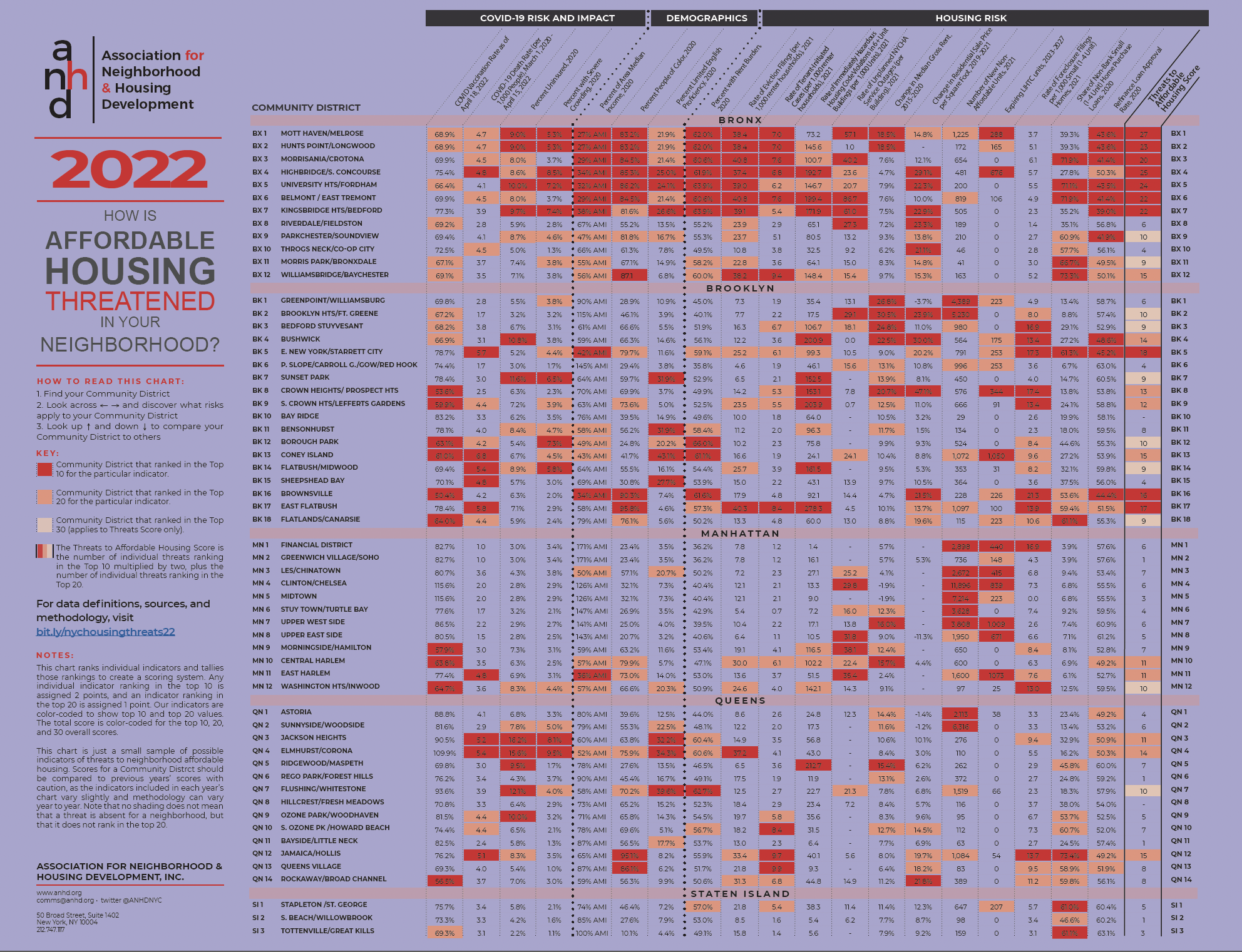
The Risk Chart uses color-coding to highlight the highest levels of risk in each district: when a number is red, it means that Community District ranks in the top 10 citywide for that risk. If it’s orange, it ranks in the top 20. And the last column, the Threats to Affordable Housing Score, tallies up an overall risk score by giving a district two points for an indicator in the top 10 and one point for an indicator in the top 20. View the full chart for yourself here.
On this page, you can find our key findings from the 2022 Housing Risk Chart, an interactive and downloadable data table, and full data notes and definitions.
When citing this information, please credit ANHD with the following language: “Original research and analysis by the Association for Neighborhood & Housing Development (ANHD), https://anhd.org/report/how-affordable-housing-threatened-your-neighborhood-2022.” If you have questions, contact comms@anhd.org.
Key Findings
General
-
The 2022 Housing Risk Chart shows that eviction filing rates are dramatically higher in communities of color and districts with the lowest incomes. The ten districts with the highest rate of eviction filings are all over 75% people of color, mirroring findings of ANHD’s ongoing research into the disproportionate impact of the pandemic on housing stability for communities of color. In fact, rates of eviction filings correspond closely with most risk indicators included in this chart, from the health impacts of COVID-19 to demographic factors like limited English proficiency to poor housing conditions and lack of access to homeownership. The correlation of eviction filing rates to a variety of other risk factors underscores the danger of cases moving full-speed ahead while hundreds of thousands of tenants remain behind on rent due to the pandemic. New Yorkers urgently need strong protections against eviction.
-
Eight of the ten districts with the highest rates of eviction filings are in the Bronx (BX 1-7 and 12), one is in Brooklyn (East Flatbush, BK 17), and one is in Queens (Elmhurst/Corona, QN 4).
-
The Risk Chart makes clear that displacement pressure and lack of access to stable housing manifest in multifaceted ways for communities of color.
-
For the first time, ANHD was able to include rates of eviction filings at the community district level in the risk chart, thanks to our collaboration with other members of the Housing Data Coalition and the Right to Counsel Coalition.
-
-
Indicators of displacement pressure due to speculation, rising prices, and gentrification are distributed throughout the Bronx, Brooklyn, Manhattan, and Queens.
-
Of the 20 districts with the largest Increases in median rents from 2015-2020, ranging from 15.4-30.5%, two were in the Bronx (BX 1 and 2), nine were in Brooklyn (BK 1-4, 6-9, and 11), four were in Manhattan (MN 6, 7, 9, and 10), and five were in Queens (QN 1, 2, 5, 6, 10).
-
The diverse and complex housing threats that New York City communities face require an integrated plan to comprehensively address homelessness and advance racial equity.
-
Too often, banks are complicit in speculation with irresponsible loans. As federal regulators update the Community Reinvestment Act (CRA) for the first time in over 25 years, they must include provisions that prevent displacement and penalize banks whose lending leads to harm.
-
-
Financial impacts of the pandemic have put many homeowners at risk of losing their homes, particularly homeowners of color who have been systematically deprived of opportunities to build wealth and access to quality loan products.
-
Nine of the ten districts with the highest rates of foreclosure filings in small (1-4 unit) homes, ranging from 13.0-21.3 per 1,000 homes, were in districts with at least two-thirds people of color and were highly concentrated in Brooklyn (BK 3-5, 8, 9, 16, 17, MN 1, 12, and QN 12).
-
Similarly, the highest shares of loans from non-bank lenders, ranging from 61.0-73.4%, which are generally higher cost and make it harder to build wealth and equity, are in predominantly communities of color. Eight of the ten districts with the highest shares of non-bank home purchase loans are in districts with at least two-thirds people of color (BX 3, 5, 6, 11, 12, BK 5, 18, and QN 12).
-
For much of the pandemic, interest rates were historically low and many homeowners took advantage of opportunities to reduce their monthly payments or tap into home equity. Rates of refinance loan approvals were much lower in communities of color – the districts with the ten lowest rates of refinance loan approvals, ranging from 39.0-48.6%, are all at least two-thirds people of color and in the Bronx (BX 1-3, 5-7, 9) and Brooklyn (BK 4, 5, and 16).
-
Access to and maintaining homeownership require access to lines of credit, which typically requires high credit scores, income, and wealth. Decades of redlining, discrimination, predatory lending and extractive practices, foreclosures, and the COVID pandemic all disproportionately harmed communities of color in all of these areas.
-
The civil rights-era CRA was passed to address these issues and yet it remains color-blind. The Housing Risk Chart shows the need for CRA updates to require banks to equitably serve communities of color.
-
Regulators must also better enforce fair lending laws under the CRA and independently to hold lenders accountable for discrimination and disparate lending patterns.
-
-
The Bronx
-
Seven of the districts with the top ten scores across all indicators were in the Grand Concourse neighborhoods of the Bronx, from Mott Haven to Kingsbridge Heights (BX 1-7). Risk indicators that were consistently high for those seven districts include rate of uninsurance, low area median income (AMI), percent with rent burden, rate of tenant-initiated housing court cases, rate of immediately hazardous housing code violations, rate of unplanned NYCHA service outages, and low refinance loan approval rates. Those same districts have high percentages of people of color, and people with limited English proficiency.
-
Bronx districts consistently rank among the highest across almost all indicators included in the chart: exceptions include increase in median rent (except in BX 1 and 2), new non-affordable units (except in BX 1 and 6), and foreclosure filings in small homes.
Brooklyn
-
Brooklyn has a mix of risk factors across almost all its districts. All but five of Brooklyn’s 18 community districts rank in the top 30 overall risk scores, and the types of risk vary across the borough, including COVID-19 risks and impacts, demographic factors, housing conditions, displacement pressure, speculation, loss of affordability, and threats to homeownership.
-
Low vaccination rates, rates of immediately hazardous housing code violations, and rates of foreclosure filings in small homes were particularly concentrated in Brooklyn districts.
-
Three Brooklyn districts rank in the top ten overall risk scores: East New York/Starrett City (BK 5), Brownsville (BK 16), and East Flatbush (BK 17).
-
East New York/Starrett City ranked in the top ten for rate of death from COVID-19 (5.7 per 1,000 people), low household income (42% AMI), and threats to homeownership (17.3 foreclosure filings per 1,000 small homes, 61.3% non-bank small home purchase loans, and 45.2% rate approvals for refinance loans). The district also ranked in the top 20 for a variety of other housing risk factors.
-
Brownsville ranked in the top ten for seven risk factors: low vaccination rate (50.4%), low household income (34% AMI), percent people of color (90.3%), percent with rent burden (61.6%), increase in residential sale price square foot (21.5% from 2019-2021), rate of foreclosure filings in small homes (21.3 per 1,000 1-4 unit homes), and low refinance loan approval rate (44.4%).
-
East Flatbush ranked in the top ten for rate of death from COVID-19 (5.8 per 1,000 people), percent people of color (95.8%), rate of eviction filings (40.8 per 1,000 renter households), rate of tenant-initiated cases (8.4 per 1,000 renter households), rate of immediately hazardous housing code violations (278.3 per 1,000 units in 6+ unit buildings), and rate of foreclosure filings in small homes (13.9 per 1,000 small unit homes).
-
Manhattan
-
On the whole, Manhattan scores relatively low for overall risk. Only three districts, all in Upper Manhattan, rank in the top 30 for overall risk scores: Central Harlem (MN 10) and East Harlem (MN 11) rank in the top 20 and Washington Heights/Inwood (MN 12) ranks in the top 30.
-
The risks that are most concentrated in Manhattan include low vaccination rates, rates of unplanned NYCHA service outages, increases in median gross rents, number of new non-affordable units, and expiring LIHTC units.
-
The number of new non-affordable units and expiring LIHTC units are especially concentrated in Manhattan, indicating an already unaffordable borough becoming even more inaccessible to lower-income New Yorkers. Six of the ten districts with the largest number of new non-affordable units are in the borough (MN 1, 3-7), reaching as many as 11,896 in Clinton/Chelsea (MN 4), which is also the highest number citywide. The number of expiring LIHTC units ranges from 223 in Midtown (MN 5) to 1,009 on the Upper West Side (MN 7).
-
Queens
-
Three districts in Queens ranked in the top 20 for overall risk scores: Jackson Heights (QN 3), Elmhurst/Corona (QN 4), and Jamaica/Hollis (QN 12). Flushing/Whitestone (QN 7) ranked in the top 30 for overall risk.
-
Rates of death from COVID-19, rates of uninsurance, limited English proficiency, and tenant-initiated cases were the most concentrated risks across Queens districts. Though generally lower than Bronx and Brooklyn, there were also high rates of non-bank home purchase loans and low refinance loan approval rates in many Queens districts.
Staten Island
-
While risk indicators across Staten Island are generally low compared to other boroughs, Stapleton/St. George (SI 1) and Tottenville/Great Kills (SI 3) ranked in the top 10 for shares of non-bank loans (61.0% and 61.1%, respectively), and South Beach/Willowbrook (SI 2) ranked in the top 20 (46.6%).
-
Stapleton/St. George, which has the lowest AMI and largest share of people of color of the three Staten Island districts, also ranked in the top 20 for three additional housing risk factors: percent with rent burden (57.0%), rate of tenant-initiated housing court cases (5.4 per 1,000 renter households), and expiring LIHTC units (207).
Data Notes and Definitions
Note on Community District and PUMA Geographies
Most data are aggregated by community districts, but indicators from the American Community Survey are aggregated by Public Use Microdata Areas (PUMAs). PUMAs are designed by the U.S. Census Bureau and approximate New York City’s community districts (CDs). However, their boundaries do not coincide precisely with community districts boundaries. There are 59 community districts in New York City, but only 55 PUMAs; four pairs of community districts were combined by the Census Bureau to improve estimates. These pairs are Mott Haven/Melrose (BX 1) and Hunts Point/Longwood (BX 2), Morrisania/Crotona (BX 3) and Belmont/East Tremont (BX 6), the Financial District (MN 1) and Greenwich Village/Soho (MN 2), and Clinton/Chelsea (MN 4) and Midtown (MN 5). Click here for a map of PUMA and Community District boundaries.
COVID Vaccination Rate as of April 18, 2022
Definition: Percent of population who have completed a primary series of vaccination (two doses of Pfizer or Moderna or one dose of Johnson & Johnson). Calculated as the total number of people who are vaccinated divided by the total population of the corresponding PUMA. For community districts that are combined to make a PUMA (see notes above), the evictions for both CDs are summed and divided by the PUMA population.
Source: Direct from NYC Department of Health and Mental Hygiene (DOHMH), ACS 2020 5-Year Estimates, Total Population.
Why is this indicator included?: Vaccination status is one of the primary determinants of health outcomes when a person contracts COVID-19. Districts with lower rates of vaccination are more likely to have higher rates of hospitalization and death due to COVID-19. Note that the rate of death due to COVID-19 in this chart includes the entire pandemic period, rather than solely after vaccinations became available, so the correlation may be hidden in this chart.
Limitations: Some districts show a vaccination rate over 100%. According to DOHMH, this may be due to recent changes in population not reflected in Census data, inconsistencies of people who identify as multi-race misreported as a single race, and self-reported addresses being different from a person’s primary home address: e.g., people may use their work address for the purpose of vaccination.
COVID-19 Death Rate (per 1,000 People), March 1, 2020 - April 15, 2022
Definition: The number of confirmed deaths due to COVID-19 between March 1, 2020 and April 15, 2022 divided by the population of the corresponding PUMA. The resulting figure is multiplied by 1,000 to find deaths per 1,000 people. For community districts that are combined to make a PUMA (see notes above), the deaths for both CDs are summed and divided by the PUMA population.
Source: Direct from NYC Department of Health and Mental Hygiene (DOHMH), ACS 2020 5-Year Estimates, Total Population.
Why is this indicator included?: Widespread and preventable death is the gravest impact of the COVID-19 crisis. We have included indicators of COVID-19 risk and impact in this chart since 2020 to show the ways that health impacts of the pandemic closely correlate to housing instability, displacement pressure, and demographic factors such as race and income.
Percent Uninsured, 2020
Definition: Percent of population with no health insurance coverage.
Source: ACS 2020 5-Year Estimates, Health Insurance.
Why is this indicator included?: People without health insurance are less likely to receive preventative medical care or treatment for chronic health conditions. Regular lack of access to quality medical care puts people at higher risk of hospitalization and death if they contract COVID-19.
Percent with Severe Crowding, 2020
Definition: Percent of renter households with 1.5 or more occupants per room.
Source: ACS 2020 5-Year Estimates, Occupants Per Room (Renter-Occupied Housing Units).
Why is this indicator included? Overcrowding leads to increased spread of COVID-19 and lack of ability to isolate when a household member is infected. It also indicates lack of housing affordability and can precede homelessness, as it is often a measure taken after eviction and/or when a household has no other viable housing options.
Percent of Area Median Income, 2020
Definition: To calculate the local Area Median Income (AMI) level, the 2020 median household income of a PUMA is adjusted/prorated by its average household size and compared to the HUD-determined income limits for the entire New York Metro Fair Market Rent Area in 2020. The area median income for a 4-person household in 2020 was $113,700.
Source: ACS 5-Year Estimates, Average Household Size, Median Household Income and U.S. Department of Housing and Urban Development (HUD) 2020 Income Limits Documentation.
Why is this indicator included? In high-rent areas like New York, HUD calculates AMI level based on market rents rather than family incomes. New York City uses AMI levels to set income qualifications and rents for affordable housing. We include this indicator to compare actual median incomes of individual community districts to AMI benchmarks.
Percent People of Color, 2020
Definition: Percent of population identifying as Black or African American, American Indian and Alaska Native, Asian, Native Hawaiian and other Pacific Islander, some other race alone, or two or more races. This is the same as the population identifying their race as anything other than White Alone. This definition of people of color does not include those who identify as both Hispanic/Latinx and White Alone.
Source: ACS 2020 5-Year Estimates, Race.
Why is this indicator included? Because of systemic racism, the health and economic impacts of COVID-19 have impacted communities of color at dramatically higher rates than white communities. We include this indicator to highlight increased risk and show correlations with other indicators.
Limitations: Grouping non-white racial identities can obscure disparities that often impact Black and indigenous communities most. Census data also obscures important racial and ethnic identities and undercounts communities of color in general. Despite these limitations, for the purpose of this chart we find it useful to include this metric to show close correlation between non-white population and overall risk: for example, 8 of the 10 districts with the largest shares of people of color rank in the top 10 districts for overall risk.
Percent Limited English Proficiency, 2020
Definition: A "limited English-speaking household" is one in which all members 14 years and older either do not speak English or do not speak English "very well."
Source: ACS 2020 5-Year Estimates, Limited English Speaking Households
Why is this indicator included? Limited English proficiency is a major barrier to accessing crucial information about COVID-19, testing, vaccinations, services, and available government support such as emergency rental assistance (ERAP).
Percent with Rent Burden, 2020
Definition: Percent of renter households paying 30% or more of income towards gross rent.
Source: ACS 2020 5-Year Estimates, Gross Rent as a Percentage of Household Income in the Past 12 Months.
Why is this indicator included? Rent burden is a commonly used indicator of strain on a household’s ability to consistently pay rent and other living expenses. Inability to consistently afford rent can lead to eviction, crowding, shelter entry, and/or homelessness.
Rate of Eviction Filings (per 1,000 Renter households), 2021
Definition: Total number of residential non-payment and holdover eviction filings in New York City housing court, divided by the renter household population of the corresponding PUMA. For community districts that are combined to make a PUMA (see notes above), the evictions for both CDs are summed and divided by the PUMA population.
Source: Data from the New York State Office of Court Administration (OCA) via the Housing Data Coalition in collaboration with the Right to Counsel Coalition, ACS 2020 5-Year Estimates, Tenure.
Why is this indicator included? Although New York State implemented various eviction protections during the pandemic, in many cases eviction cases could still be filed, leading to possible future eviction judgments and displacing tenants.
Rate of Tenant-Initiated Cases (per 1,000 Renter Households), 2021
Definition: Total number of residential HP (housing part), HP with harassment, harassment, and illegal lockout filings in New York City housing court, divided by the renter household population of the corresponding PUMA. For community districts that are combined to make a PUMA (see notes above), the evictions for both CDs are summed and divided by the PUMA population.
Source: Data from the New York State Office of Court Administration (OCA) via the Housing Data Coalition in collaboration with the Right to Counsel Coalition, ACS 2020 5-Year Estimates, Tenure.
Why is this indicator included? These cases represent legal actions that tenants take against their landlord to make needed repairs, stop harassment, and regain access to their homes after being locked out. Tenant-initiated cases against their landlords represent an important indicator of risk for those tenants and affordable housing in general.
Limitations: This indicator does not capture harassment and lack of repairs that tenants do not bring to housing court, nor do all cases represent tenant harassment. There is no comprehensive reporting or data source of tenant harassment and systematic lack of housing repairs.
Rate of Immediately Hazardous Housing Code Violations in 6+ Unit Buildings (per 1,000 Units), 2021
Definition: New Class C (“immediately hazardous”) violations of the Housing Maintenance Code issued by the Department of Housing Preservation and Development (HPD) in properties with 6 or more residential units. This figure is divided by all residential units in 6+ unit properties in the corresponding community district and then multiplied by 1,000 to find the rate of serious violations per 1,000 residential units.
Source: NYC HPD Housing Maintenance Code Violations and New York City Department of Planning’s PLUTO 21v3 database.
Why is this indicator included? Housing Maintenance Code violations are a commonly used indicator of poor housing conditions, and high numbers can indicate systemic lack of repairs and poor building maintenance that rises to the level of tenant harassment.
Limitations: Violations are only issued when tenants know to report conditions to 311 and those complaints result in an HPD inspector gaining access to the building or unit to inspect conditions. Tenants report frequent issues with HPD inspections after filing complaints with 311. Many tenants also fear retaliation from their landlord if they file complaints with 311. Therefore, this dataset does not comprehensively capture poor building and apartment conditions.
Rate of Unplanned NYCHA Service Outages (per Building), 2021
Definition: Number of unplanned elevator, heat, hot water, water, and electricity service outages per building in New York City Housing Authority (NYCHA) developments in the corresponding community district. A value of ‘-’ indicates there is no data available; these districts likely have no NYCHA housing.
Source: NYCHA Service Disruptions scraped by the Housing Data Coalition and Development Data Book.
Why is this indicator included? Unplanned service disruptions are one metric of the scale of poor conditions for residents of public housing.
Limitations: NYCHA does not publish performance metrics as open data. The Housing Data Coalition has scraped NYCHA’s dashboard of unplanned service disruptions as one important measure of the scale of poor conditions for residents.
Change in Median Gross Rent. 2015-2020
Definition: The rate of change in median gross rent (monthly rent plus the estimated average monthly cost of utilities) for a community district in 2020 versus 2015. 2015 rents are adjusted for inflation to 2020 numbers for comparison.
Source: ACS 2020 and 2015 5-Year Estimates, Median Gross Rent and Inflation Calculator using Consumer Price Index data (inflation factor = 1.07987).
Why is this indicator included? Rent increases in a community district indicate changing market conditions that displace many low income residents from their neighborhoods. Tenants in unregulated and unsubsidized housing are generally most vulnerable to displacement when neighborhood rents increase.
Change in Residential Sale Price per Square Foot, 2019-2021
Definition: Change in median price per gross square foot of residential buildings of all unit sizes from 2019 to 2021 for each community district. To make comparisons as accurate as possible, sales are only included if the building contains no commercial units, the recorded sale price is over $100,000, the gross square footage is over 500 square feet, the price per square foot is over $100, and the number of sales per community district for both 2019 and 2021 is at least 50. Because they do not generally record square footage, condo and coop sales are excluded.
Source: NYC Department of Finance Annualized Sales.
Why is this indicator included? Increasing residential sale prices are an indicator of displacement pressure and exclusion in a neighborhood. To offset higher sale prices, purchasers will increase rents of individual apartment units. Homeownership also becomes more unattainable for low-income households and people of color. Large increases in sale prices contribute to heightened speculation in the housing market as other sellers aim to match high sale prices.
Limitations: It is difficult to make fair comparisons of residential property values: records and data are imperfect, building typologies vary greatly across and within community districts, there are much higher sale volumes in some districts than others, and there is no straightforward way to compare coop and condo sales with sales of entire residential buildings.
Number of New Non-Affordable Units, 2021
Definition: Number of residential units in new buildings issued temporary or permanent certificates of occupancy in 2021, excluding units recorded as Extremely Low Income (0-30% AMI), Very Low Income (31-50% AMI), or Low Income (51-80% AMI) under Housing New York. For more information on Area Median Incomes, see HPD’s website.
Source: NYC Department of Buildings Certificates of Occupancy and NYC HPD Housing New York Units by Building.
Why is this indicator included? As ANHD’s AMI Cheat Sheet makes clear, 67% of New York City’s renter households and 92.7% of New York City’s rent-burdened households make 80% AMI or less. Apartments that are only affordable for households making over 80% AMI, including the vast majority of new market-rate units, do not increase the supply of affordable housing for New Yorkers who actually need it. In many cases, the addition of high-end housing to a neighborhood pushes overall rent and living costs up and pushes long-term residents, predominantly people of color and low-income New Yorkers, out of their neighborhoods. Boosting affordable housing supply via neighborhood rezonings has been a central goal of recent New York City housing and land use policy, but ANHD has found that neighborhood rezonings in low-income, BIPOC neighborhoods are more likely to produce a lower ratio of affordable housing than what occurs there without a rezoning.
Expiring LIHTC units, 2023-2027
Definition: Number of units in buildings receiving Low Income Housing Tax Credits (4% or 9%) that are eligible to expire between December 31, 2023 and December 31, 2027, inclusive. Data is current as of August 2021. For more information on LIHTC, see the Furman Center’s Directory of NYC Housing Programs.
Source: NYU Furman Center's CoreData.nyc.
Why is this indicator included? When a LIHTC regulatory agreement period ends, the agreement can be renewed or it can expire, meaning apartments exit affordability requirements and rents can spike. This has been a particularly concerning issue recently with the Right of First Refusal – which allows nonprofits to purchase buildings they develop at the end of the regulatory period – being threatened by predatory investors.
Rate of Foreclosure Filings per 1,000 Small (1-4 Unit) Homes, 2021
Definition: Mortgage-related foreclosure filings, also called lis pendens or pre-foreclosures, for buildings with 1-4 residential units. This figure is divided by the total number 1-4 residential unit properties in the corresponding community district and then multiplied by 1,000 to find the rate of foreclosures per 1,000 small homes. This indicator excludes coops and condos.
Source: PropertyShark via DAP Portal.
Why is this indicator included? Many small homeowners struggled to make mortgage payments during the pandemic due to economic impacts and decreased income from COVID-19, including reduced rental income from tenants in 2-4 family homes. Homeowners who couldn't access COVID relief funds and/or forbearance options are especially at risk of foreclosure.
Share of Non-Bank Small (1-4 Unit) Home Purchase Loans, 2020
Definition: Number of 1-4 unit home purchase loans made by independent mortgage companies, or “non-bank lenders”, that are not covered by the Community Reinvestment Act, as a share of all 1-4 family, owner-occupied, first-lien loans.
Source: Home Mortgage Disclosure Act (HMDA), 2020.
Why is this indicator included? Due to historic and current discrimination and structural racism in the home lending market, many people of color seeking to purchase a home are unable to access traditional bank loans and resort to, or are targeted by, higher cost non-bank lenders, making it harder to build wealth and equity. This pattern is especially pronounced in majority Black communities.
Refinance Loan Approval Rate, 2020
Definition: Percentage of refinance applications that are approved and originated. Outcomes that are not included were either denied, a “soft denial” meaning either incomplete or withdrawn, or approved but the borrower declined to accept.
Source: Home Mortgage Disclosure Act (HMDA), 2020.
Why is this indicator included? For much of the COVID-19 pandemic, interest rates were historically low and many homeowners took advantage of the opportunity to refinance their home mortgages to reduce their monthly payments or tap into home equity. Low approval rates reflect a lack of access to refinancing as a wealth-building tool and indicate lenders are not meeting an important financial need.