How is Affordable Housing Threatened in Your Neighborhood? 2024

ANHD's 2024 Housing Risk Chart, How is Affordable Housing Threated in Your Neighborhood, highlights and ranks 18 indicators of demographics and housing risk in each of New York City's 59 community districts to inform targeted, neighborhood-level action. Our annual analysis helps community-based groups, government officials, and other stakeholders determine where to direct resources to stabilize communities. Made possible with discretionary funding from the New York City Council through their Community Housing Preservation Strategies Initiative (CHPSI), the 2024 Housing Risk Chart demonstrates the varied, intersecting risks to affordable housing and stability for communities of color and neighborhoods that are home to historically marginalized groups. 

About the Housing Risk Chart

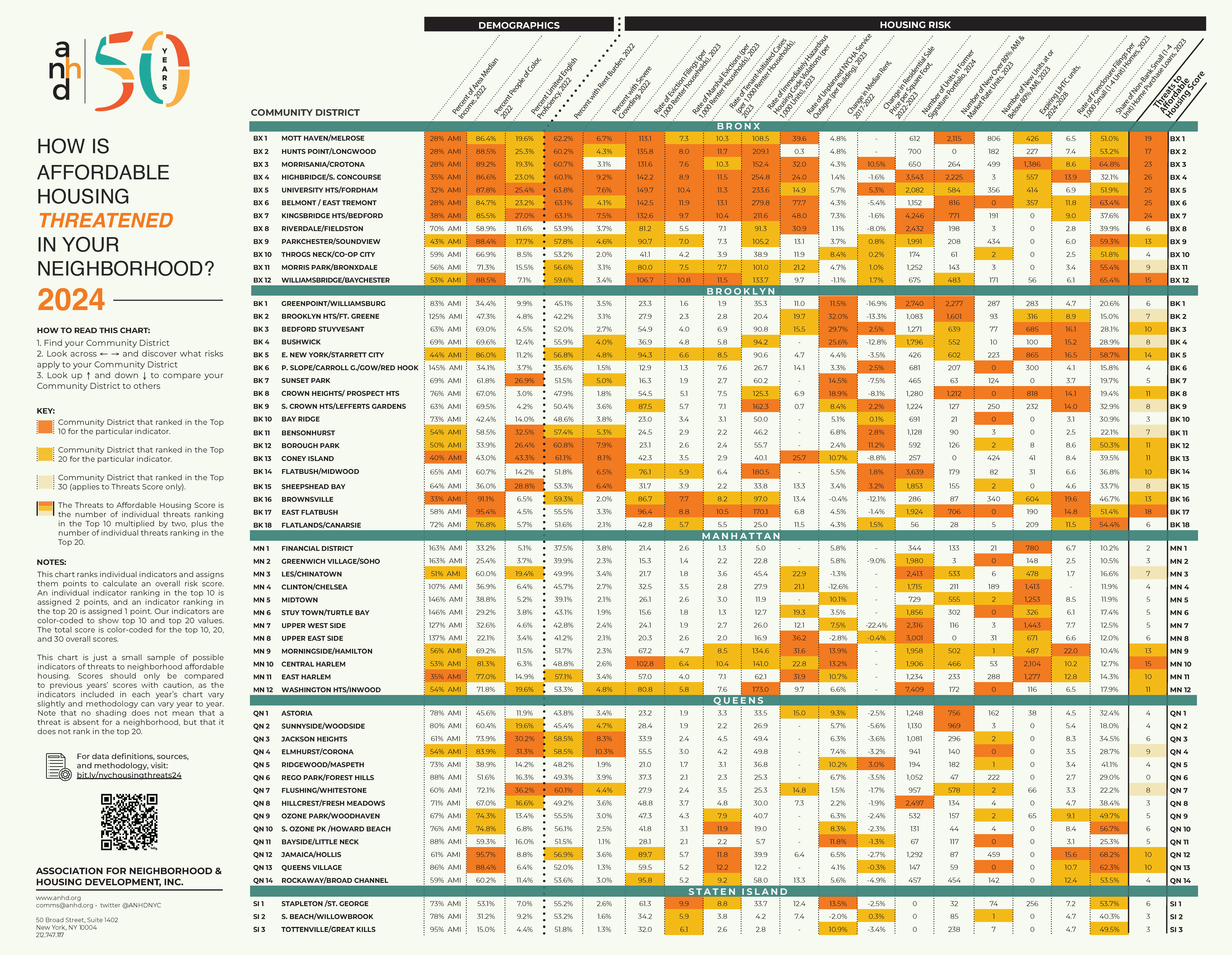
On this page, you can find our key findings from the 2023 Housing Risk Chart, an interactive and downloadable data table, and full data notes and definitions.

The Housing Risk Chart uses color coding to highlight the highest levels of risk in each district: when a value is orange, it means that Community District ranks in the top ten citywide for that risk. When it's yellow, it ranks in the top twenty. The last column, the Threats to Affordable Housing Score, tallies up an overall risk score by assigning districts two points for each indicator that ranks in the top ten and one point for each indicator that ranks in the top twenty.

About CHPSI 

The Housing Risk Chart is funded by the Community Housing Preservation Strategies Initiative (CHPSI). For over 15 years, through CHPSI, the New York City Council has supported two programs to ensure organizations across community districts can work in their neighborhoods to combat the loss of affordable housing in their community:

  • The Housing Preservation Initiative (HPI) directly addresses threats to each neighborhood’s affordable housing stock by working with community residents to create neighborhood-based solutions.

  • The Community Consultant Contract (CCC) supports front-line anti-displacement services and specialists who work with community residents and constituent services to fight evictions and foreclosures.

The Risk Chart makes clear the importance of targeted and individualized programs like HPI and CCC, which allow over 40 community-based organizations to work at a neighborhood level to address specific threats to affordable housing and housing stability.

Key Findings

General

Tens of thousands of units across four boroughs were financed by Signature Bank before it collapsed.

Units that were in Signature Bank’s portfolio before it collapsed are distributed across all boroughs except Staten Island, but are most concentrated in Manhattan, Brooklyn, and the Bronx.  Community districts with especially high numbers of former Signature units are Washington Heights/Inwood (MN 12) with 7,409 units, Kingsbridge Heights/Bedford (BX 7) with 4,246 units, Flatbush/Midwood (BK 14) with 3,639 units, and Highbridge/South Concourse (BX 4) with 3,543 units. Those four districts all rank in the top twenty for overall housing risk and have high numbers of severe crowding, evictions, and hazardous housing code violations.

Before its collapse, Signature Bank was the second-largest multifamily lender in New York City. Signature was notorious for lending to some of the city’s worst landlords with speculative loans that overleveraged buildings and relied on the displacement of long-time, low-income tenants to turn a profit. ANHD has been raising the alarm on Signature Bank’s bad lending practices for years, and the collapse of the bank presents an opportunity for tenants to organize and push new mortgage holders for better conditions in their buildings.

Six districts across four boroughs show particularly inequitable new housing development.  

This year, ANHD included two complimentary metrics to examine what type of housing is being added in each community district:

Number of New Over 80% AMI & Market Rate Units in 2023 is aimed at understanding how many “high-rent” housing units were added in each community district, whether they are classified as “affordable” but targeted to households making over 80% AMI or whether they are unregulated, market-rate units. In 2023, a two-bedroom unit over 80% AMI had a rent of more than $2,542. Higher risk for this indicator is assigned to community districts with more high-rent units added in 2023.

Number of New Units at or Below 80% AMI in 2023 shows how much “lower-rent” housing was added at 80% AMI or below – meaning the maximum rent for a two-bedroom unit was $2,542. While $2,542 is still quite high, available data did not allow for disaggregation without excluding all “Low Income” affordable units between 51% and 80% AMI, so we chose to include them. Higher risk is assigned to community districts with fewer lower-rent units added in 2023.

Examining these two indicators along with Percent of AMI and other demographic indicators further illustrate which neighborhoods are enduring development that does not serve existing residents. The following districts had large numbers of high-rent units added, negligible lower-rent units added, and their district median income equates to less than 80% AMI. Except for one (MN 3), they all have above-average populations of people of color.

For the third year in a row, evictions soared – especially in communities of color.

The 2024 Housing Risk Chart once again shows that eviction filings – along with evictions ordered by court-ordered marshals – primarily occur in neighborhoods that are mostly people of color and have some of the lowest incomes in New York City, and they have continued to accelerate since pandemic-era protections expired in January 2022.

  • While the top ten eviction filing rates varied from 37.2-40.8 in 2021 and 83.0-121.3 in 2022, they ranged from 96.4-149.7 per thousand renter households in 2023. The rapid escalation of eviction cases has overwhelmed housing courts, tenants, and attorneys. 

  • Like last year, eight of the top ten CDs with the highest rates of eviction filings were in the Bronx (BX 1-7 and 12) and one was in Brooklyn (East Flatbush, BK 17). In contrast from previous years, Central Harlem (MN 10) had one of the highest eviction filing rates as well. 

Evictions are highly correlated with race, echoing ANHD’s previous research. All of the top ten CDs with the highest rates of eviction filings and nine of the top ten CDs with the highest rates of marshal evictions are over 80% people of color (compared to 69.1% citywide).


Bronx

As in previous years, Bronx districts rank highest for threats to affordable housing citywide and seven of its districts rank in the top ten for overall risk citywide. Compounding risk factors point to long-standing divestment from Bronx communities, particularly those with the highest shares of people of color. 

  • Bronx districts 1 through 7, spanning west of the Bronx River up to Woodlawn Cemetery, all rank in the top ten overall threats to affordable housing. 

  • BX 1-7 and Williamsbridge/Baychester (BX 12) rank particularly high for rent burden (59.6%-63.8%), eviction filings (106.7-149.7 per 1,000 renter households), marshal evictions (7.3-11.9 per 1,000 renter households), tenant-initiated housing court cases (10.3-13.1 cases per 1,000 renter households), and immediately hazardous housing violations (108.5-279.8 per 1,000 units in 6+ unit buildings).

  • Those same districts have among the lowest incomes (31% AMI-59% AMI), highest shares of people of color (84.7%-89.2%), and highest shares of limited English proficiency (19.6%-27.0%, excluding BX 12).


Brooklyn

  • Brooklyn neighborhoods saw by far the highest increases in median rents in recent years (adjusting for inflation). Brooklyn was the only borough with neighborhoods seeing an over 20% increase in rents, reaching up to 32.0% in Brooklyn Heights/Fort Greene (BK 2), 29.7% in Bedford Stuyvesant (BK 3), and 25.6% in Bushwick (BK 4). Greenpoint/Williamsburg (BK 1), Sunset Park (BK 7), and Crown Heights (BK 8) also ranked in the top ten citywide for rent increases, all upwards of 10%. 

  • Several low and lower-income neighborhoods in Brooklyn saw significant additions of high-rent units without large numbers of lower-rent units. Crown Heights added 1,212 high-rent units and zero lower-rent units. East Flatbush (BK 17) added 706 high-rent units and zero lower-rent units. Bedford Stuyvesant added 639 high-rent units and 77 lower-rent units. Bushwick added 552 high-rent units and 10 lower-rent units. 

  • Brooklyn has among the highest rates of foreclosure filings in any borough, with seven of its districts ranking in the top ten citywide, ranging from 14.0 foreclosures per 1,000 small homes in South Crown Heights/Prospect Heights (BK 9) to 19.6 in Brownsville (BK 16).


Manhattan

New York City’s most affluent borough shows higher housing risks than in recent years, with the highest risk in Upper Manhattan. Central Harlem (MN 10) ranked in the top ten for overall risk and Morningside/Hamilton Heights (MN 9), East Harlem (MN 11), and Washington Heights/Inwood (MN 12) ranked in the top twenty. Those districts have incomes ranging from 39% AMI-62% AMI and above-average populations of people of color (69.2-81.3%). 

  • Manhattan districts had high rates of unplanned NYCHA service outages, with seven out of twelve districts ranking in the top twenty and three in the top ten: 36.2 per building on the Upper East Side (MN 8), 21.9 in East Harlem, and 31.6 in Morningside/Hamilton Heights. Rates of NYCHA outages in Manhattan were surpassed only by rates in the Bronx.

  • Manhattan has the largest number of units formerly in the Signature Bank portfolio:  26,861 out of 79,488 citywide (33.8%). There are 7,409 former Signature units in Washington Heights/Inwood, 3,001 units on the Upper East Side, 2,413 units on the Lower East Side/Chinatown (MN 3), and 2,316 units on the Upper West Side (MN 7). 

  • Manhattan has the largest number of LIHTC units subject to expire in the next five years: 10,496 out of 19,026 units citywide (55.2%). There are 2,104 units set to expire in Central Harlem, 1,443 units on the Upper West Side, and 1,413 units  in Clinton/Chelsea (MN 4).


Queens

Overall, the borough of Queens has fewer high-risk districts than the Bronx, Brooklyn, and Manhattan. The highest-risk districts are Jamaica/Hollis (QN 12) and Queens Village (QN 13) in the top twenty, and Elmhurst/Corona (QN 4) and Flushing/Whitestone (QN 7) ranked in the top 30. 

  • Of all boroughs, Queens added the fewest new units of lower-rent housing in 2023. Queens added 1,003 of 6,251 units citywide, or just 16.0%. Ten out of fourteen districts added no more than 4 new units. The districts that did add higher numbers of lower-rent units were Jamaica/Hollis (QN 12) with 459 new units, Rego Park/Forest Hills (QN 6) with 222 new units, Astoria (QN 1) with 162 new units, and Rockaway/Broad Channel (QN 14) with 142 new units. 

  • Inflation-adjusted median rents increased in every Queens community district from 2017-2022, ranging from 1.5% in Flushing/Whitestone to 11.8% in Bayside/Little Neck (QN 11).

  • At the same time, residential sale prices decreased in every community district in Queens from 2022-2023, with the exception of Ridgewood/Maspeth (QN 4), where the price per square foot increased by 3.0%. 

  • Rates of tenant-initiated housing court cases were high in Queens, with five districts ranking in the top twenty citywide. Queens Village had 12.2 cases per 1,000 renter households, South Ozone Park/Howard Beach (QN 10) had 11.9, and Jamaica/Hollis had 12.2. 

  • Two districts show a close correlation between the proportion of people of color and risk to homeownership like foreclosures and non-bank loans. Jamaica/Hollis, where 95.7% of the population is people of color, had 15.6 foreclosures per 1,000 small homes and 68.2% of loans were made by non-bank lenders. Queens Village, where 87.8% of the population is people of color, had a foreclosure rate of 10.7 and 62.3% non-bank loans. High foreclosure rates and shares of non-bank loans, which are generally higher-cost and potentially predatory, in communities of color reinforce historic redlining and deprivation of access to homeownership and wealth-building.


Staten Island

  • While risks in Staten Island were low compared to other boroughs, there were still high rates of some risk factors, especially in Stapleton/St. George (SI 1) – which also has the lowest income (81% AMI) and highest proportion of people of color (53.1%) in the borough.

  • All three Staten Island districts ranked in the top twenty for rates of residential marshal evictions, from 5.9 per 1,000 renter households in South Beach/Willowbrook (SI 2) to 9.9 in Stapleton/St. George. 

  • Stapleton/St. George saw a 13.5% increase in median rents from 2017-2022, and Tottenville/Great Kills saw a 10.9% increase.

Data table

Data notes and definitions

When citing the Housing Risk Chart, please credit the Association for Neighborhood & Housing Development (ANHD) and include the URL https://anhd.org/report/how-affordable-housing-threatened-your-neighborhood-2024. If you have questions, contact comms@anhd.org

New this year

The risk indicators that ANHD includes in the Risk Chart vary slightly each year. This year, ANHD included three new indicators:

  • Rate of Residential Marshal Evictions 

  • Number of New Units at or Below 80% AMI

  • Number of Units in Signature Buildings 

These three indicators have taken the place of three COVID-related indicators that were included in the 2020, 2021, and 2022 charts. That data is largely no longer updated, and we believe that ongoing threats to affordable housing and housing stability that were exacerbated by the COVID pandemic are captured in other indicators such as AMI, rent burden, severe crowding, eviction filings, and evictions.

Risk Indicators

Percent of Area Median Income, 2022

Definition: To calculate the neighborhood’s Area Median Income (AMI) level, the 2022 median household income is adjusted by its average household size at the PUMA level. The adjusted AMI for a PUMA is then compared to the HUD-determined income limits (a.k.a. 100% AMI) for the entire New York Metro Fair Market Rent Area in 2022. 100% of area median income for a 4-person household in 2022 was $133,400. 

Source: Census ACS 5-Year Estimates: Average Household Size, Median Household Income and U.S. Department of Housing and Urban Development (HUD) 2022 Income Limits Documentation.

Why is this indicator included? In high-rent areas like New York, HUD calculates AMI level based on market rents rather than family incomes. New York City uses AMI levels to set income qualifications and rents for affordable housing. We include this indicator to compare actual median incomes of individual community districts to AMI benchmarks.

Limitations Because this indicator is based on a median value, we use Census Public Use Microdata Areas (PUMA) geographies instead of Community District Tabulation Areas (CDTAs). You can find out more information about each of those geographies via the Department of City Planning.

Percent People of Color, 2022

Definition: Percent of population identifying as Black or African American, American Indian and Alaska Native, Asian, Native Hawaiian and other Pacific Islander, some other race alone, or two or more races for each Community District Tabulation Area (CDTA). This is the same as the population identifying their race as anything other than White Alone. This definition of people of color does not include those who identify as both Hispanic/Latinx and White Alone. 

Source: Census ACS 2022 5-Year Estimates, Race.

Why is this indicator included? Systemic racism in our society's laws, housing, planning, and policies leads to threats to housing, health, and wellbeing that impact communities of color at dramatically higher rates than white communities. We include this indicator to highlight increased risk and show correlations with other indicators.

Limitations: Grouping non-white racial identities can obscure disparities that often impact Black and indigenous communities most. Census data also obscures important racial and ethnic identities and undercounts communities of color in general. Despite these limitations, for the purpose of this chart we find it useful to include this metric to show close correlation between non-white population and overall risk

Percent Limited English Proficiency, 2022

Definition: The Census defines a "limited English-speaking household" as one in which all members 14 years and older either do not speak English or do not speak English "very well." Calculated as the percentage of limited English-speaking households divided by the total number of households of the corresponding CDTA. 

Source: Census ACS 2022 5-Year Estimates, Limited English Speaking Households.

Why is this indicator included? Limited English proficiency is a major barrier to accessing crucial information, including government and social services such as a right to counsel in eviction cases, housing lotteries, and more. 

Percent with Rent Burden, 2022

Definition: Percent of renter households paying 30% or more of income towards gross rent divided by the total number of renter households of the corresponding CDTA. 

Source: Census ACS 2022 5-Year Estimates, Gross Rent as a Percentage of Household Income in the Past 12 Months.

Why is this indicator included? Rent burden is a commonly used indicator of strain on a household’s ability to consistently pay rent and other living expenses. Inability to consistently afford rent can lead to eviction, crowding, shelter entry, and/or homelessness.

Percent with Severe Crowding, 2022

Definition: Percent of households with 1.5 or more occupants per room. Calculated as the total number of households living with 1.5 or more occupants per room divided by the total number of households of the corresponding CDTA, represented as a percentage. 

Source: Census ACS 2022 5-Year Estimates, Occupants Per Room.

Why is this indicator included? Overcrowding often indicates a lack of housing affordability and can often precede homelessness, as it is frequently a measure taken after eviction and/or when a household has no other viable housing options.

Rate of Eviction Filings (per 1,000 Renter households), 2023

Definition: Total number of residential non-payment and holdover eviction filings in New York City housing court, divided by the renter household population of the corresponding CDTA. 

Source: New York State Office of Court Administration (OCA) via the OCA Data Collective in collaboration with the Right to Counsel Coalition, Census ACS 2022 5-Year Estimates, Tenure.

Why is this indicator included? Eviction filings are one of the most direct indicators of displacement risk that we have, as they show the initiation of a legal process that can end with a tenant’s forceful removal from their home. While not all eviction cases end in evictions, many tenants who are taken to court for eviction “self-evict” because they believe it is their only option, and that is not captured in any data source. Research has shown that tenants with legal representation are much more likely to be able to stay in their homes. 

Rate of Residential Marshal Evictions (per 1,000 Renter Households), 2023

Definition: Marshal evictions represent the number of tenants evicted from their homes by a city marshal following a court order. This rate is calculated by dividing the total number of residential marshal evictions by the renter household population of the corresponding CDTA, and then multiplying by 1,000 to get the rate per 1,000 renter households.

Source: Department of Investigations via the Housing Data Coalition’s NYCDB, Census ACS 2022 5-Year Estimates, Tenure.

Why is this indicator included? While eviction filings represent a large universe of potential evictions, marshal evictions represent a subset of evictions that definitively occurred. 

Limitations: Marshal evictions are an undercount of all evictions, because tenants can self-evict before a court orders a marshal to execute a warrant for eviction. 

Rate of Tenant-Initiated Cases (per 1,000 Renter Households), 2023

Definition: Total number of residential HP (housing part), HP with harassment, harassment, and illegal lockout filings in New York City housing court, divided by the renter household population of the corresponding CDTA. 

Source: New York State Office of Court Administration (OCA) via the OCA Data Collective in collaboration with the Right to Counsel Coalition, Census ACS 2022 5-Year Estimates, Tenure.

Why is this indicator included? These cases represent legal actions that tenants take against their landlord to make needed repairs, stop harassment, and regain access to their homes after being locked out. Tenant-initiated cases against their landlords represent an important indicator of risk for those tenants and affordable housing in general.

Limitations: This indicator does not capture harassment and lack of repairs that tenants do not bring to housing court, nor do all cases definitively represent tenant harassment that occurred. There is no comprehensive reporting or data source of tenant harassment or systematic lack of housing repairs. 

Rate of Immediately Hazardous Housing Code Violations (per 1,000 Units), 2023

Definition: Class C (“immediately hazardous”) violations of the Housing Maintenance Code issued in 2023 by the Department of Housing Preservation and Development (HPD) in all properties. This figure is divided by all residential units in the corresponding community district and then multiplied by 1,000 to find the rate of serious violations per 1,000 residential units. In previous years, only buildings with at least 6 residential units were included in this indicator. In 2024, we expanded this indicator to count violations in all residential buildings, to highlight conditions in smaller buildings as well as larger multifamily buildings. 

Source: NYC HPD Housing Maintenance Code Violations and New York City Department of Planning’s PLUTO 24v1 database.

Why is this indicator included? Housing Maintenance Code violations are a commonly used indicator of poor housing conditions, and high numbers can indicate systemic lack of repairs and poor building maintenance that rises to the level of tenant harassment. 

Limitations: Violations are only issued when tenants know to report conditions to 311 and those complaints result in an HPD inspector gaining access to the building or unit to inspect conditions. Tenants report frequent issues with HPD inspections after filing complaints with 311. Many tenants also fear retaliation from their landlord if they file complaints with 311, especially if their apartment is not regulated. Therefore, this dataset does not comprehensively capture poor building and apartment conditions.

Rate of Unplanned NYCHA Service Outages (per Building), 2023

Definition: Number of unplanned elevator, heat, hot water, water, and electricity service outages per building in New York City Housing Authority (NYCHA) developments in the corresponding community district. A value of ‘-’ indicates there is no data available; these districts likely have no NYCHA housing.

Source: NYCHA Service Disruptions scraped by the Housing Data Coalition, Development Data Book.

Why is this indicator included? Unplanned service disruptions are one metric of the scale of poor conditions for residents of public housing.

Limitations: NYCHA does not publish performance metrics as open data. The Housing Data Coalition has scraped NYCHA’s dashboard of unplanned service disruptions as one important measure of the scale of poor conditions for residents.

Change in Median Gross Rent. 2017-2022

Definition: The rate of change in median gross rent (monthly rent plus the estimated average monthly cost of utilities) for a community district by PUMA in 2022 versus 2017. 2017 rents are adjusted for inflation to 2022 numbers for comparison. 

Source: Census ACS 2022 and 2017 5-Year Estimates, Median Gross Rent and Inflation Calculator using Consumer Price Index data (inflation factor = 1.19393).

Why is this indicator included? Rent increases in a community district indicate changing market conditions that displace many low income residents from their neighborhoods. Tenants in unregulated housing are generally most vulnerable to displacement when neighborhood rents increase.

Change in Residential Sale Price per Square Foot, 2022-2023

Definition: Change in median price per gross square foot of residential buildings of all unit sizes from 2022 to 2023 for each community district by PUMA. To make comparisons as accurate as possible, sales are only included if the building contains no commercial units, the recorded sale price is over $100,000, the gross square footage is over 500 square feet, the price per square foot is over $100, and the number of sales per community district for both 2022 and 2023 is at least 50. Because they do not generally record square footage, condo and coop sales are excluded. In previous years, we compared changes in sale prices over the course of two years. In 2024, we made the decision to compare changes over the course of one year, to show more recent fluctuations. 

Source: NYC Department of Finance Annualized Sales.

Why is this indicator included? Increasing residential sale prices are an indicator of displacement pressure and exclusion in a neighborhood. To offset higher sale prices, purchasers will increase rents of individual apartment units. Homeownership also becomes more unattainable for low-income households and people of color. Large increases in sale prices contribute to heightened speculation in the housing market as other sellers aim to match high sale prices. 

Limitations: It is difficult to make fair comparisons of residential property values: records and data are imperfect, building typologies vary greatly across and within community districts, there are much higher sale volumes in some districts than others, and there is no straightforward way to compare coop and condo sales with sales of entire residential buildings. Because we are not able to include coops and condos, most Manhattan districts show no data for this indicator; instead, it is more indicative of multifamily rental building and small home sales. . 

Number of Units in Former Signature Portfolio, 2024

Definition: Total number of residential units in the portfolio of properties previously financed by Signature Bank.

Source: University Neighborhood Housing Program

Why is this indicator included? This indicator illustrates the scale of Signature Bank's residential portfolio and its potential impact on local communities following the bank's collapse. The number of units in these properties is crucial for understanding the magnitude of the situation and assessing the potential consequences for tenants, landlords, and neighborhoods. Additionally, it provides insight into the extent of organizing efforts needed to address any challenges and opportunities arising from the bank's downfall.

Number of New Over 80% AMI & Market Rate Units, 2023

Definition: Number of total new residential units in 2023, excluding affordable housing units designated as Extremely Low Income (0-30% AMI), Very Low Income (31-50% AMI), or Low Income (51-80% AMI). This indicator includes new market rate and income-restricted housing above 80% AMI.

Source: NYC Department of Planning Housing Database and NYC HPD Affordable Housing Production by Building.

Why is this indicator included? As ANHD’s AMI Cheat Sheet makes clear, 64.5% of New York City’s renter households and 91.5% of New York City’s rent-burdened households make 80% AMI or less. Apartments that are only affordable for households making over 80% AMI, as well as the vast majority of new market-rate units, do not increase the supply of affordable housing for New Yorkers who most need it. In 2023, a two-bedroom apartment above 80% AMI had a rent of more than $2,542 and the median asking rent for market rate apartments was over $3,500

Limitations: This indicator is calculated using two separate datasets: DCP’s housing database and HPD’s dataset of affordable housing. Because they are compiled differently, there are discrepancies. Three districts showed larger numbers of units below 80% AMI than total new units in 2023: MN 8, BX 2, and BK 13. In those cases, we displayed a value of 0 for this indicator. 

Number of New Units at or Below 80% AMI, 2023

Definition: Number of total new affordable housing units designated as Extremely Low Income (0-30% AMI), Very Low Income (31-50% AMI), or Low Income (51-80% AMI). 

Source: NYC HPD Affordable Housing Production by Building.

Why is this indicator included? In contrast to the above, this indicator shows how much “lower-rent” housing was added at 80% AMI or lower – meaning the maximum rent for a two-bedroom unit was $2,542. 

Limitations: While $2,542 is still too high for most rent-burdened New Yorkers to afford, data did not allow for disaggregation without excluding all “Low Income” affordable units between 51% and 80% AMI, so we chose to include them. 

Expiring LIHTC units, 2024-2028

Definition: Number of units in buildings receiving Low Income Housing Tax Credits (4%, 9%, or Year 15 agreements) that are eligible to expire between December 31, 2024 and December 31, 2028, inclusive. Data is current as of December 2023. For more information on LIHTC, see the Furman Center’s Directory of NYC Housing Programs. In previous years, we only included LIHTC 4% and LIHTC 9%. This year, we added LIHTC Year 15 to our calculations. Therefore, overall numbers are significantly higher than in previous years. 

Source: NYU Furman Center's CoreData.nyc.

Why is this indicator included? When a LIHTC regulatory agreement period ends, the agreement can be renewed or it can expire, meaning apartments exit affordability requirements and rents can spike. This has been a particularly concerning issue with the Right of First Refusal – which allows nonprofits to purchase buildings they develop at the end of the regulatory period – being threatened by predatory investors. 

Rate of Foreclosure Filings per 1,000 Small (1-4 Unit) Homes, 2023

Definition: Mortgage-related foreclosure filings, also called lis pendens or pre-foreclosures, for buildings with 1-4 residential units. This figure is divided by the total number 1-4 residential unit properties in the corresponding community district and then multiplied by 1,000 to find the rate of foreclosures per 1,000 small homes. This indicator excludes coops and condos.

Source: PropertyShark via DAP Portal.

Why is this indicator included? Systemic racism in lending and economic structures have led to increasingly untenable conditions for Black homeowners and other homeowners of color. Difficulty obtaining high-quality loans lead to precarious circumstances and the risk of falling behind on mortgages, taxes, or utilities. Foreclosure filings indicate that homeowners are at risk of losing their homes and are at risk of speculative and predatory behavior such as deed theft.

Share of Non-Bank Small (1-4 Unit) Home Purchase Loans, 2022

Definition: Percentage of 1-4 unit home purchase loans made by independent mortgage companies, or “non-bank lenders”, that are not covered by the Community Reinvestment Act, as a share of all 1-4 family, owner-occupied, first-lien loans.

Source: Home Mortgage Disclosure Act (HMDA), 2022.

Why is this indicator included? Due to historic and current discrimination and structural racism in the home lending market, many people of color seeking to purchase a home are unable to access traditional bank loans and resort to, or are targeted by, higher cost non-bank lenders, making it harder to build wealth and equity. This pattern is especially pronounced in majority Black communities.

Share this page: